

SS21 STAYCATION
#STAYCATION is about the optimistic reality, post pandemic. The uncertainty of when we will travel normally and safely again, will have many of us choosing to stay closer to home for our vacations.
There is a spotlight around the difficulty of being ‘individual’. And an increased importance of style more than fashion, with a desire for new experiences.
After the pandemic we will see the rise in community spirit, strike a chord with our consumers, with optimistic print and colour and nostalgic themes.
Everyone from bloggers, to families, to groups of friends and individuals will be seeking newness in the areas around us, for fun weekends and holidays, that are instagrammable and individual, without being too twee.
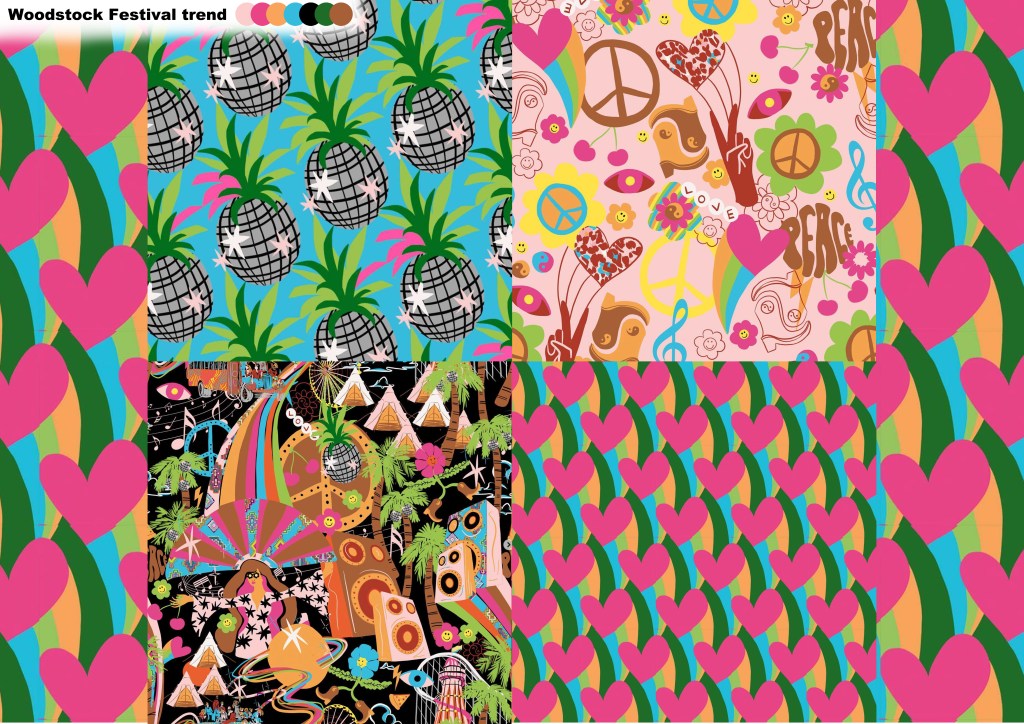
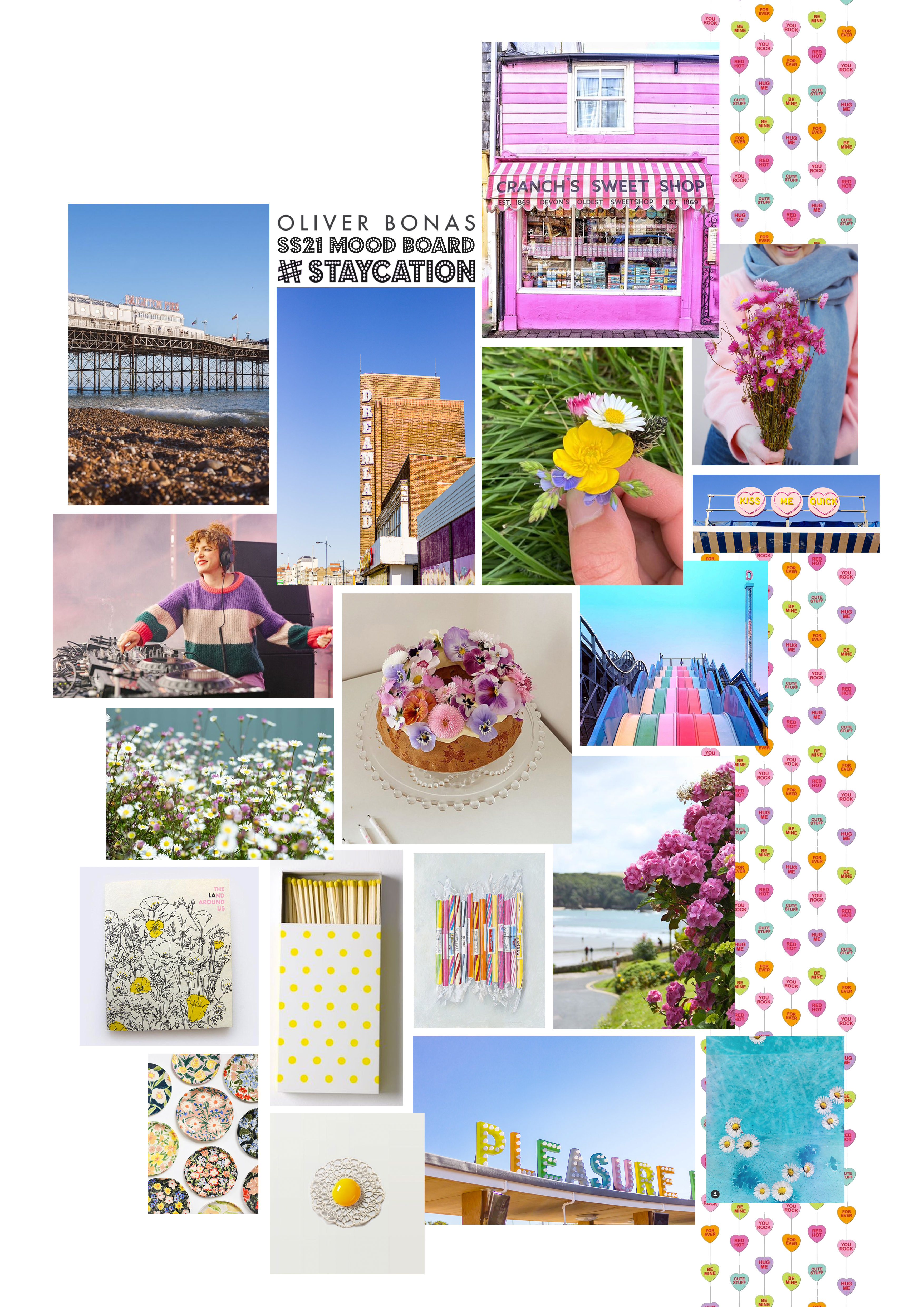
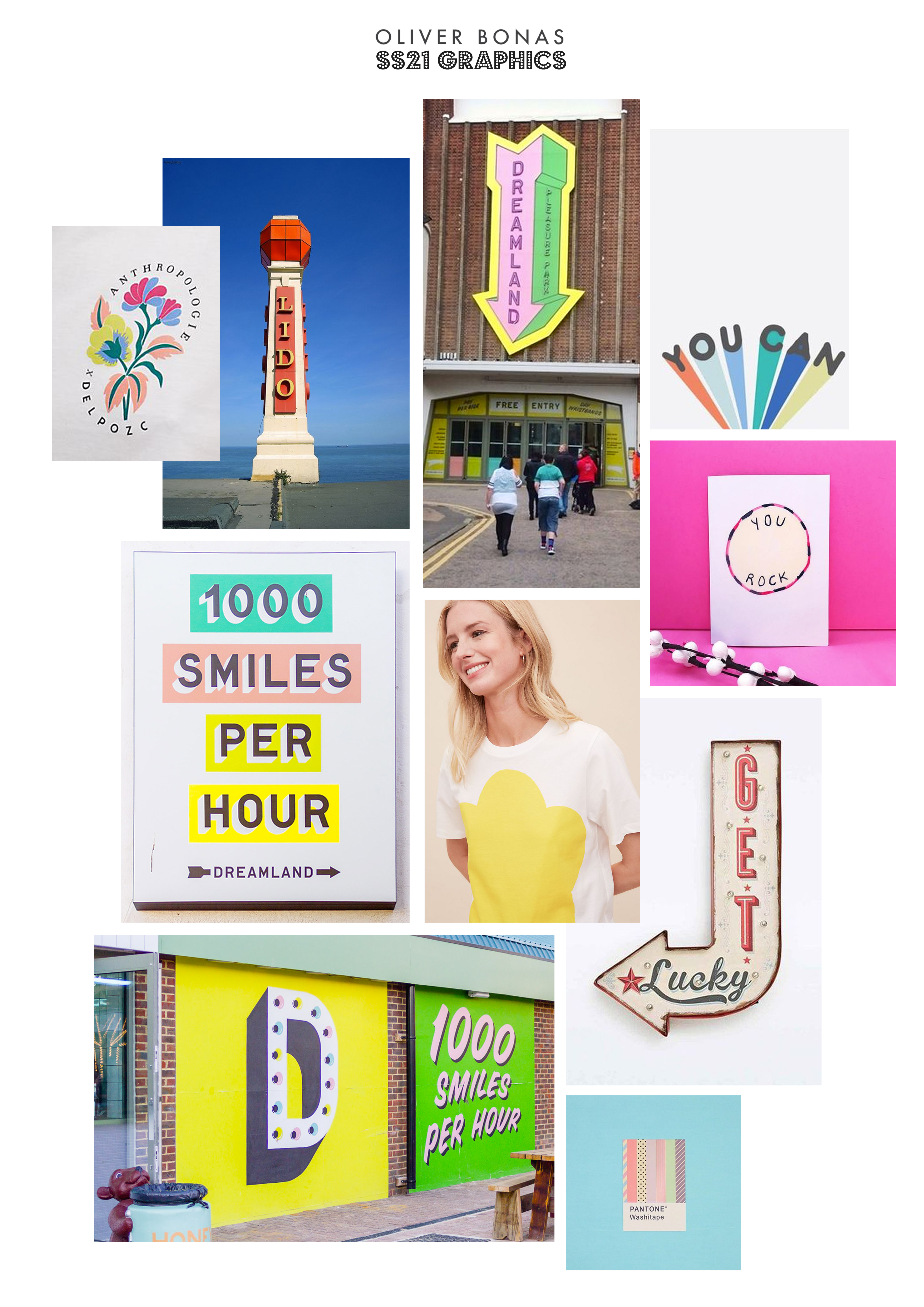
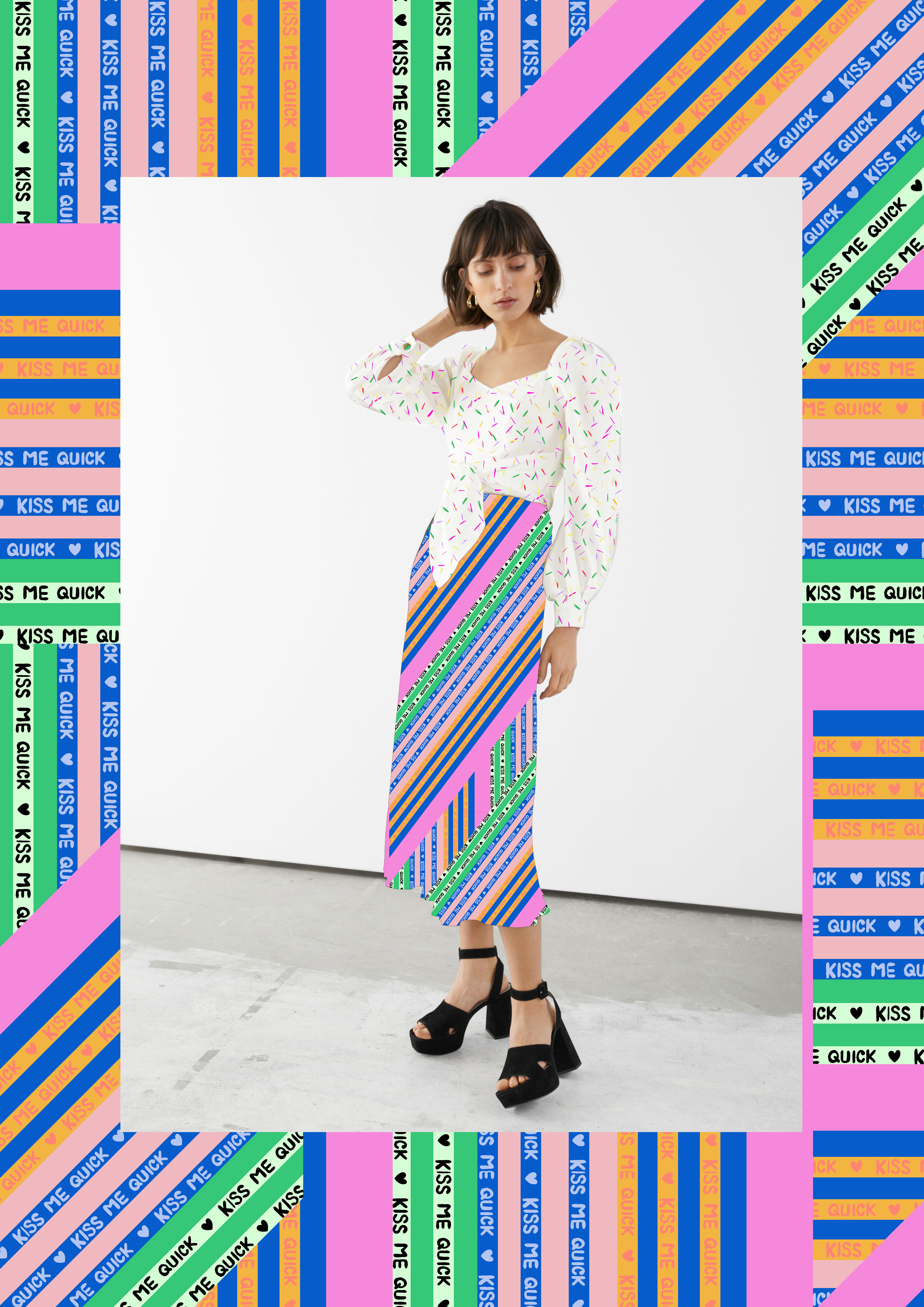
I have researched into trending SS21 holiday locations, Margate, Whitstable and Brighton to name a few. Dreamland in Margate, a retro theme park, is a huge starting point for this project on colour and prints, from ‘Kiss me quick’ slogans to typography inspiration.
New experiences in these out of city locations will be trending, events like Annie Mac at Dreamland will be even more sought after with a summer close to home. We will see a rise in music and arts events, come to more unique locations around the country, in a bid to keep ticket sales on the rise.
The ‘Above keyboard dressing’ trend, has become a huge campaign in the industry and will continue as the ‘working from home’ phase is set to be our new normal. This is where prints and graphics can play a big part in hitting this sell.
This years #STAYHOME trend will still be relevant next summer. We have seen the rise in at-home arty activities and creative baking, just for something to update our social media with. Companies have jumped on board too, with the need for fresh campaigns during pandemic. This is a new opportunity that has been emerging with influencers, celebs and the general public on social media that we cannot ignore. This is something I have taken on board in my designing.
#STAYCATION
MOODBOARD
#STAYCATION
COLOUR TREND
SS21 sees a resurgence of nostalgic and youthful colours as a form of escapism from the pandemic reality. Whilst brands will struggle to stand out from the crowd post pandemic, this colour palette of playful combination possibilities will help overcome this.
Colours are being used to enhance wellbeing, as consumers respond to clean, restorative and positive colour messages.
This palette embraces joy despite the challenging mood, with consumers seeking newness in joyful brights, teamed back with monochrome and pastels.
These upbeat brights have already played a big part in the catwalks, so we expect to see them hit the shops in SS21.
‘The Happy blossoms’ is a trending dried flower delivery service, which has boomed during the pandemic, gifting and deliveries will continue to be on the rise with unique services like they offer being relevant.

#STAYCATION
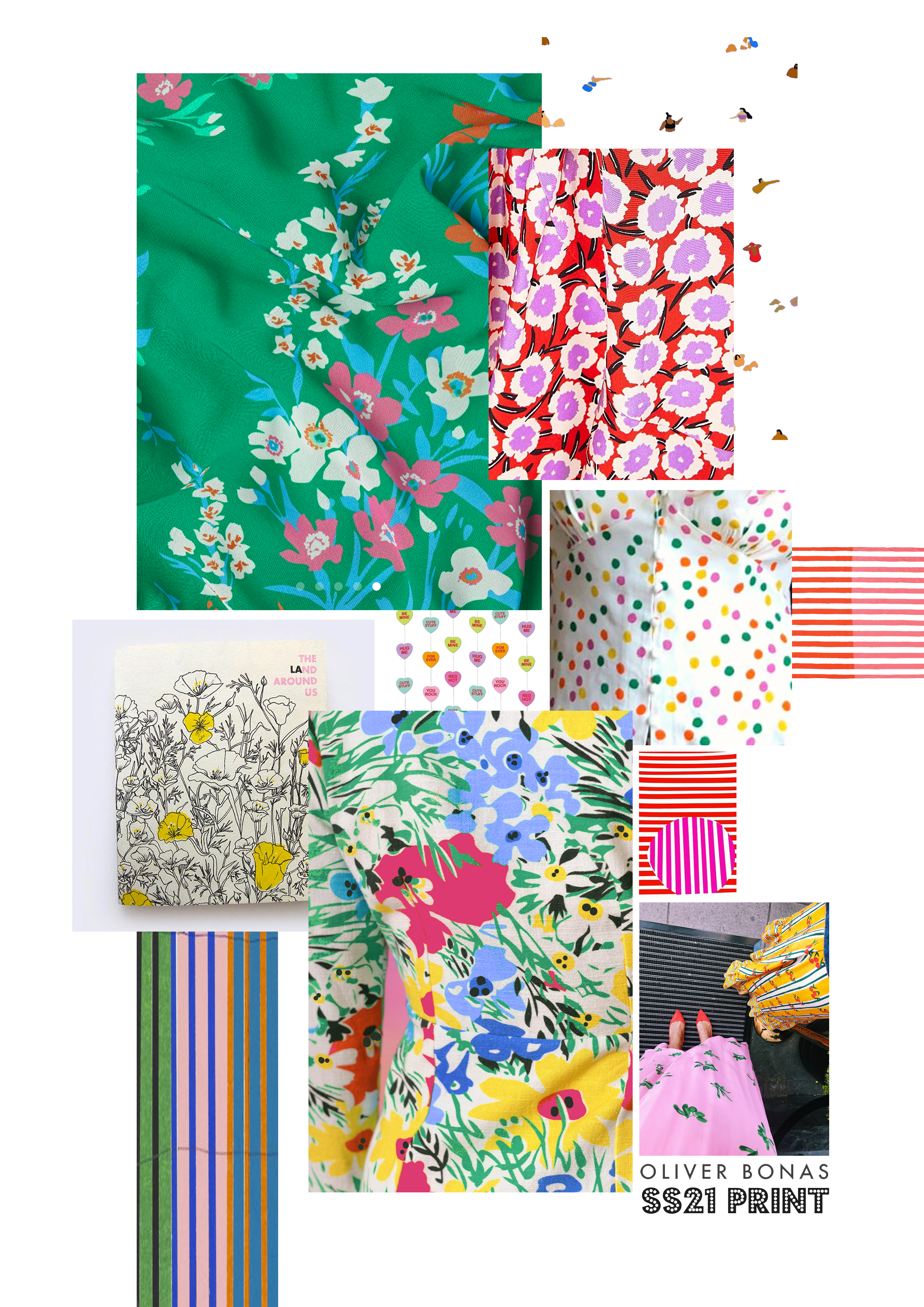
PRINT BOARD
#STAYCATION
GRAPHICS AND TYPOGRAPHY BOARD
#STAYCATION
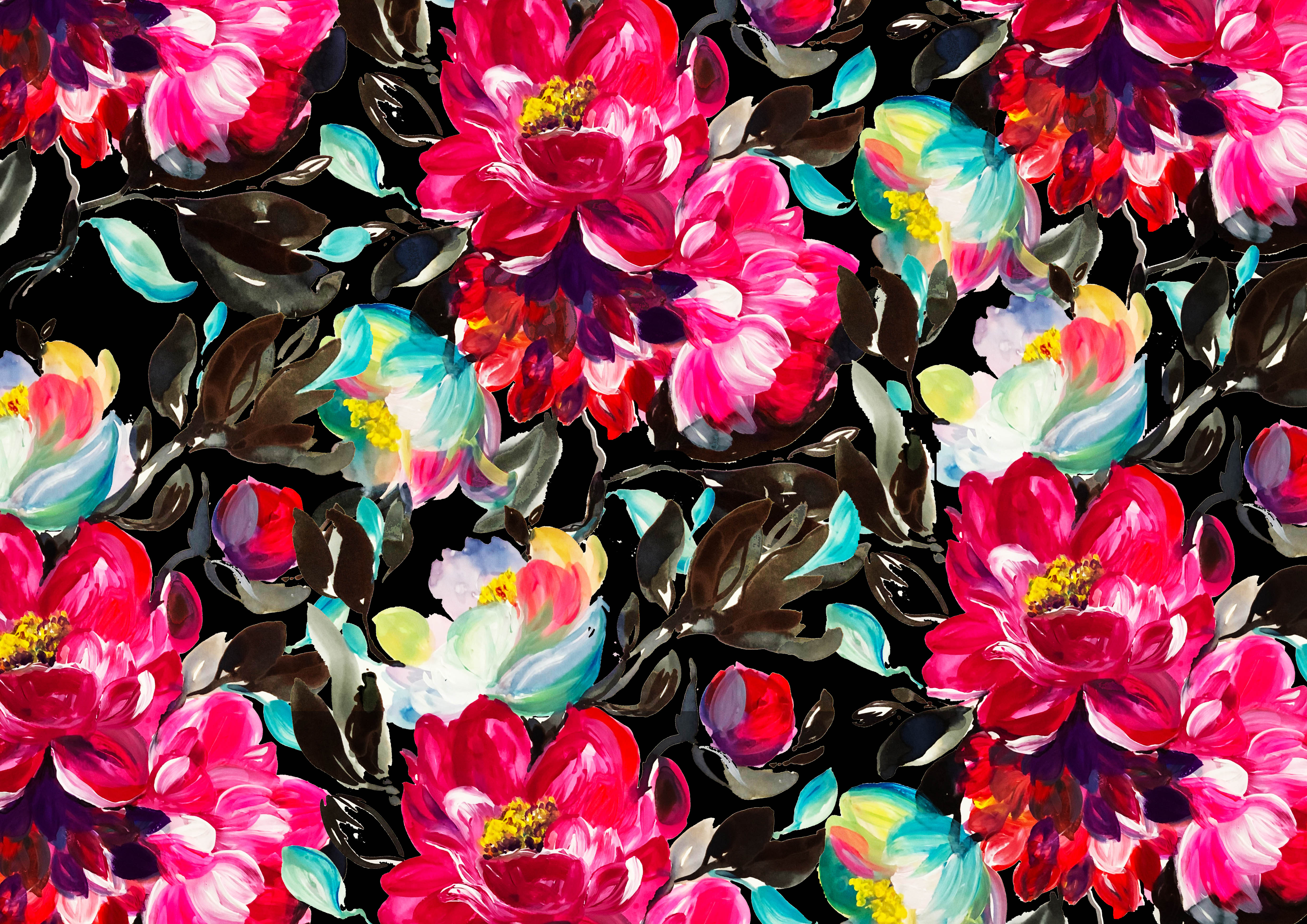
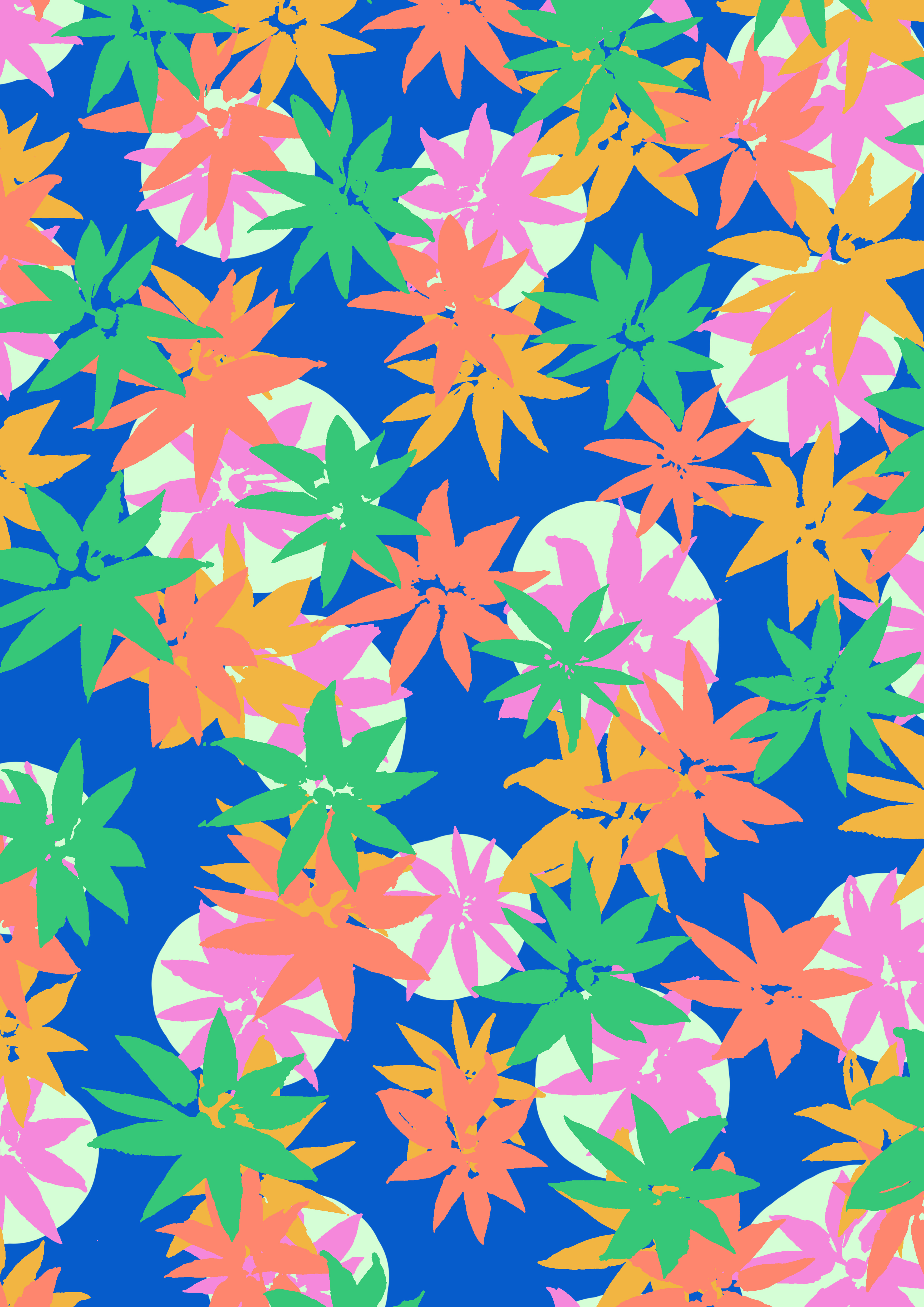
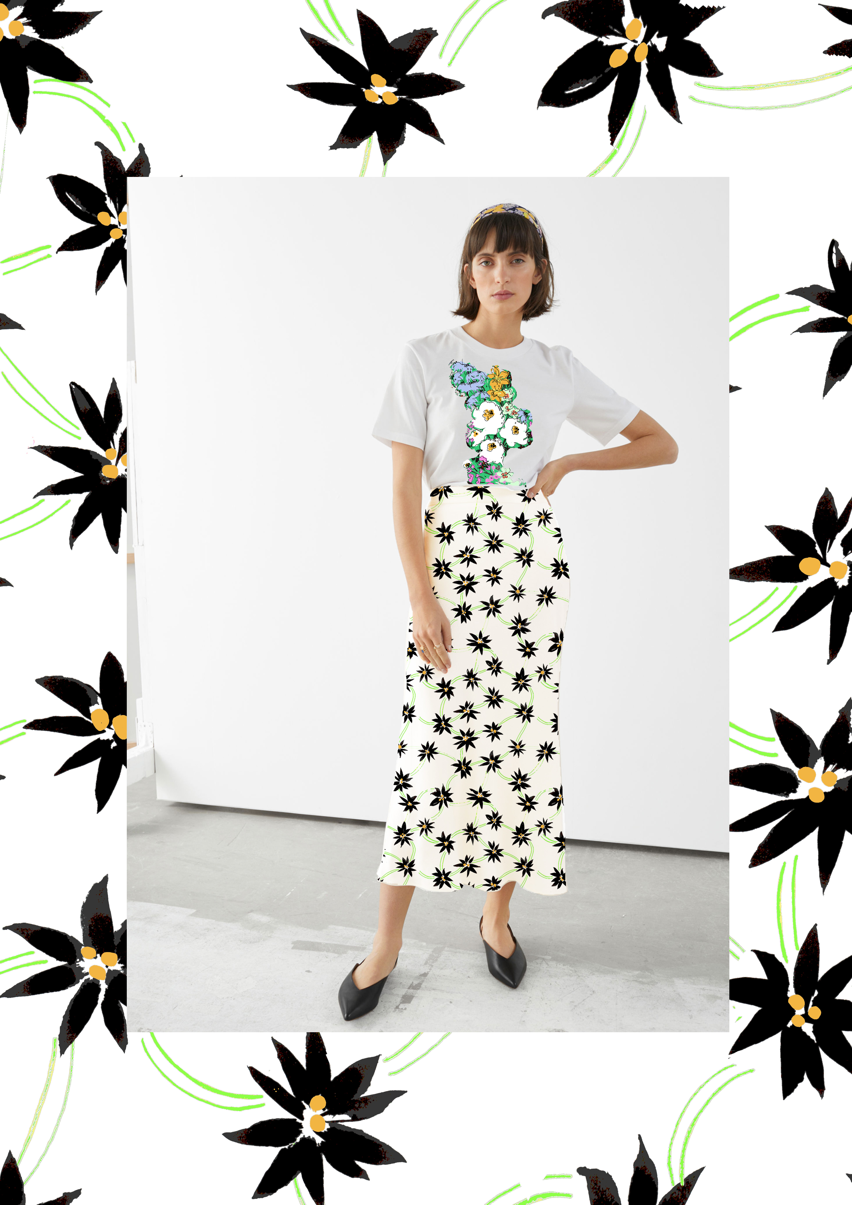
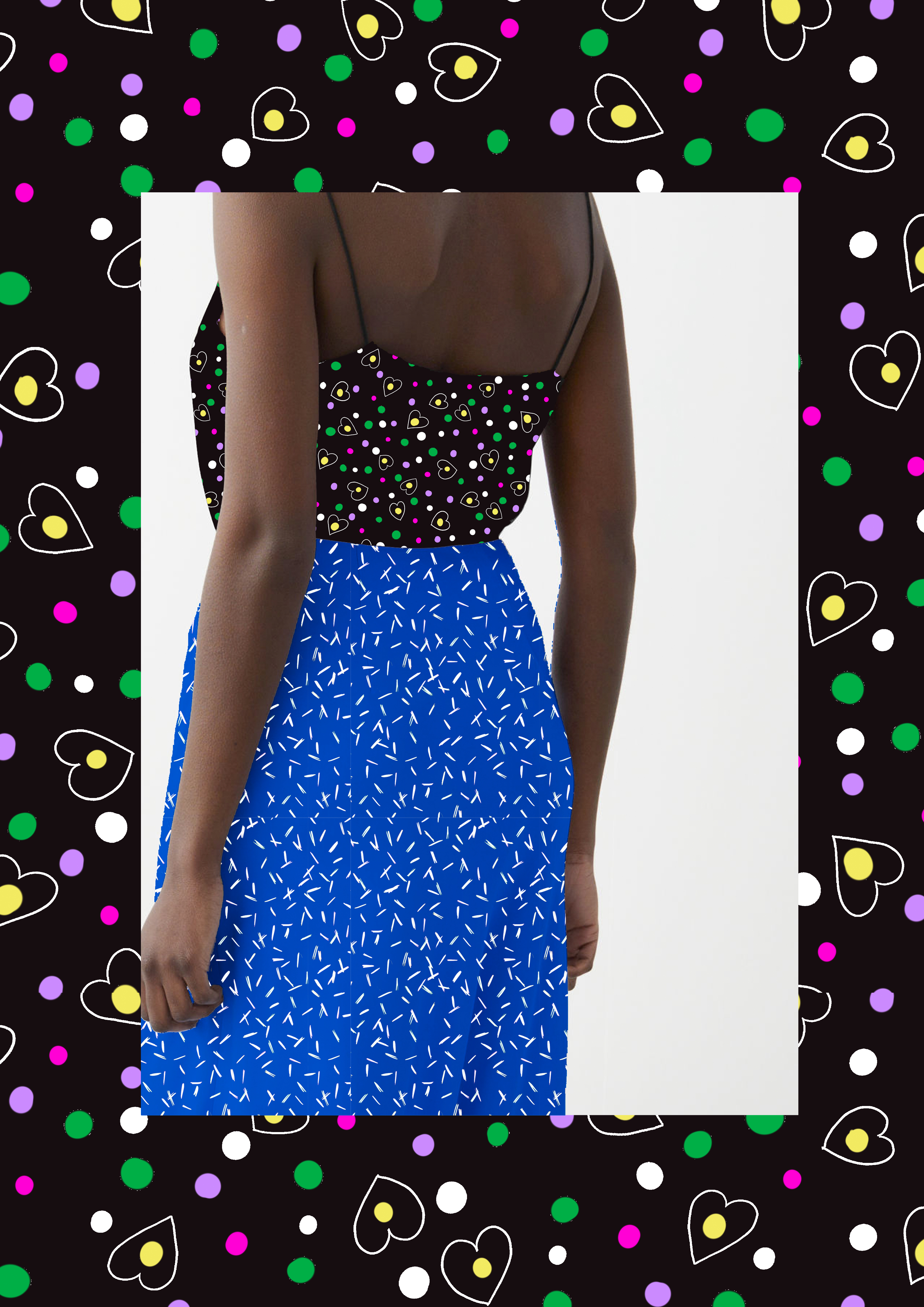
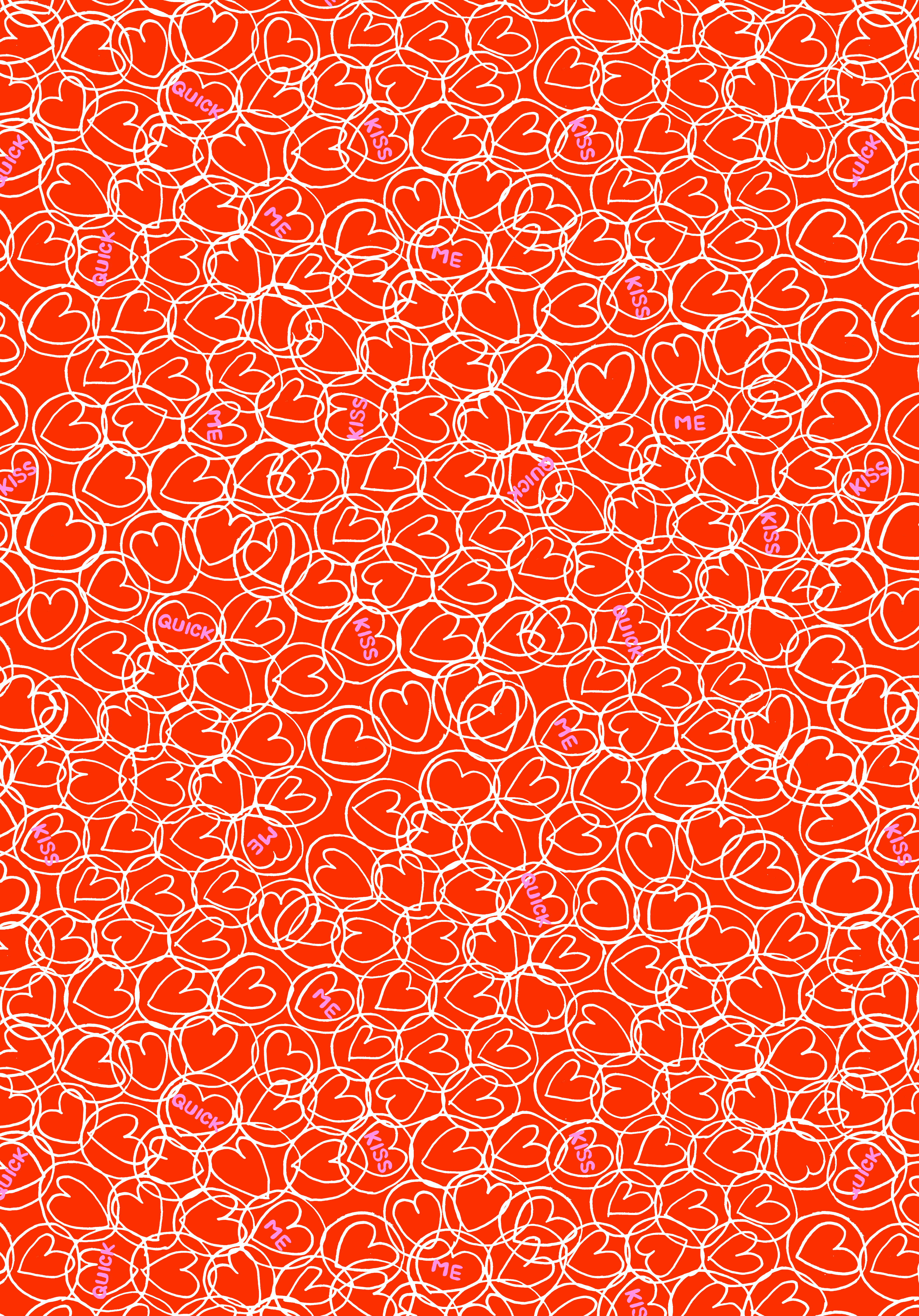
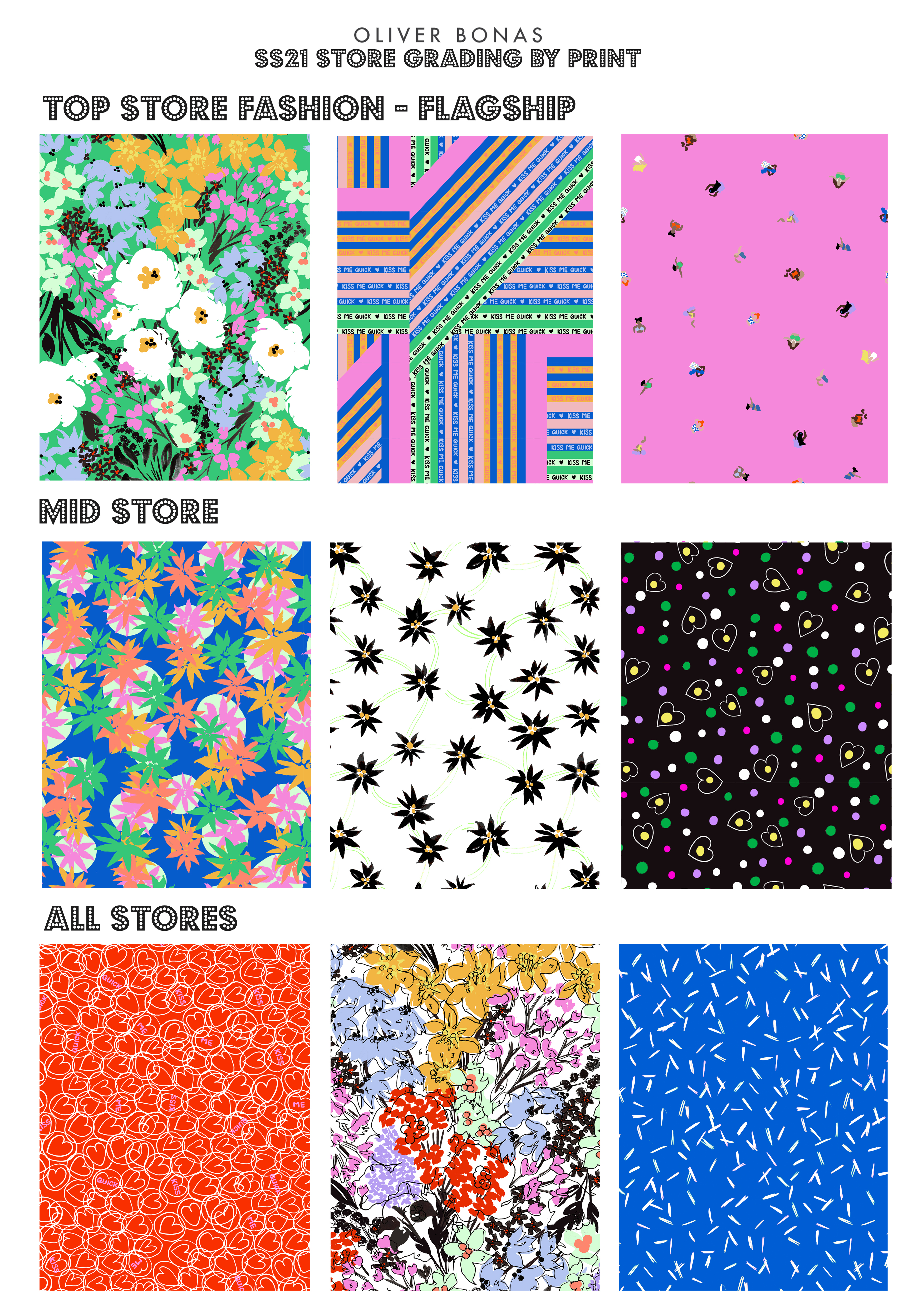
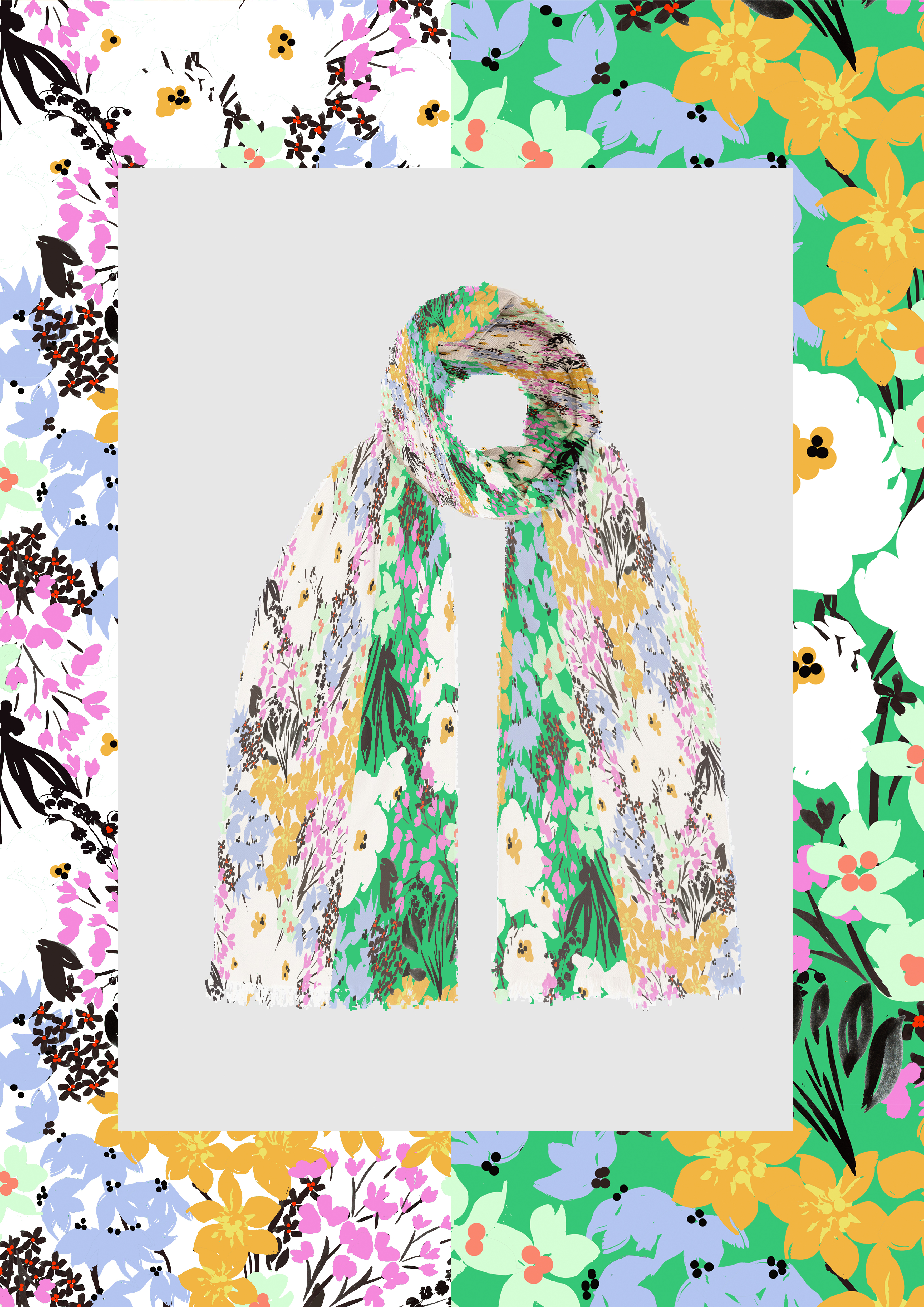
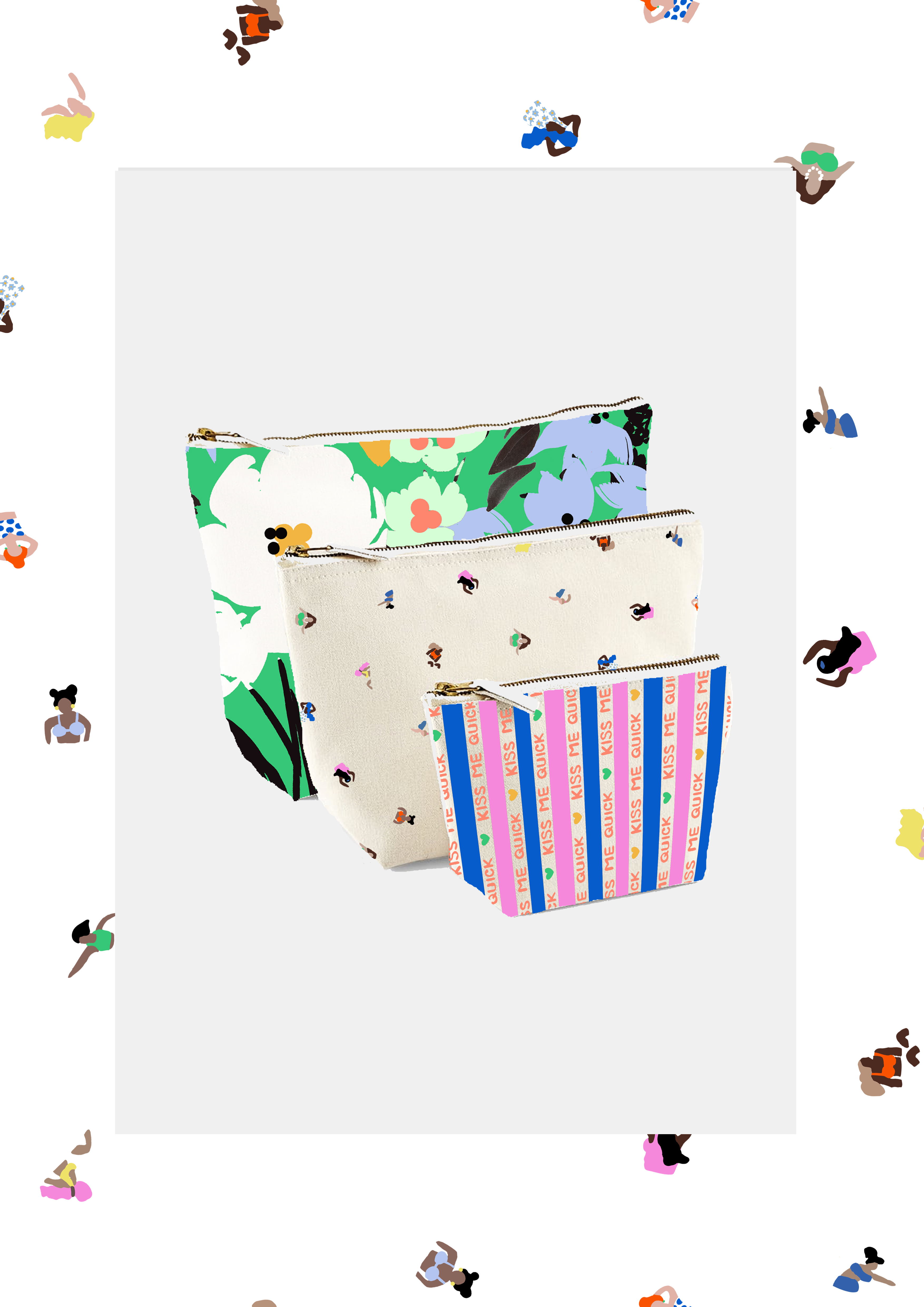
HERO PRINTS (TOP STORE)
#STAYCATION prints have been inspired by all of the above.
Colour by number competitions have been a huge trend with designers on Instagram, with the likes of ‘MaxMadeMeDoIt’ and ‘StudioCoverdale’ creating their own and having hundreds of entries.
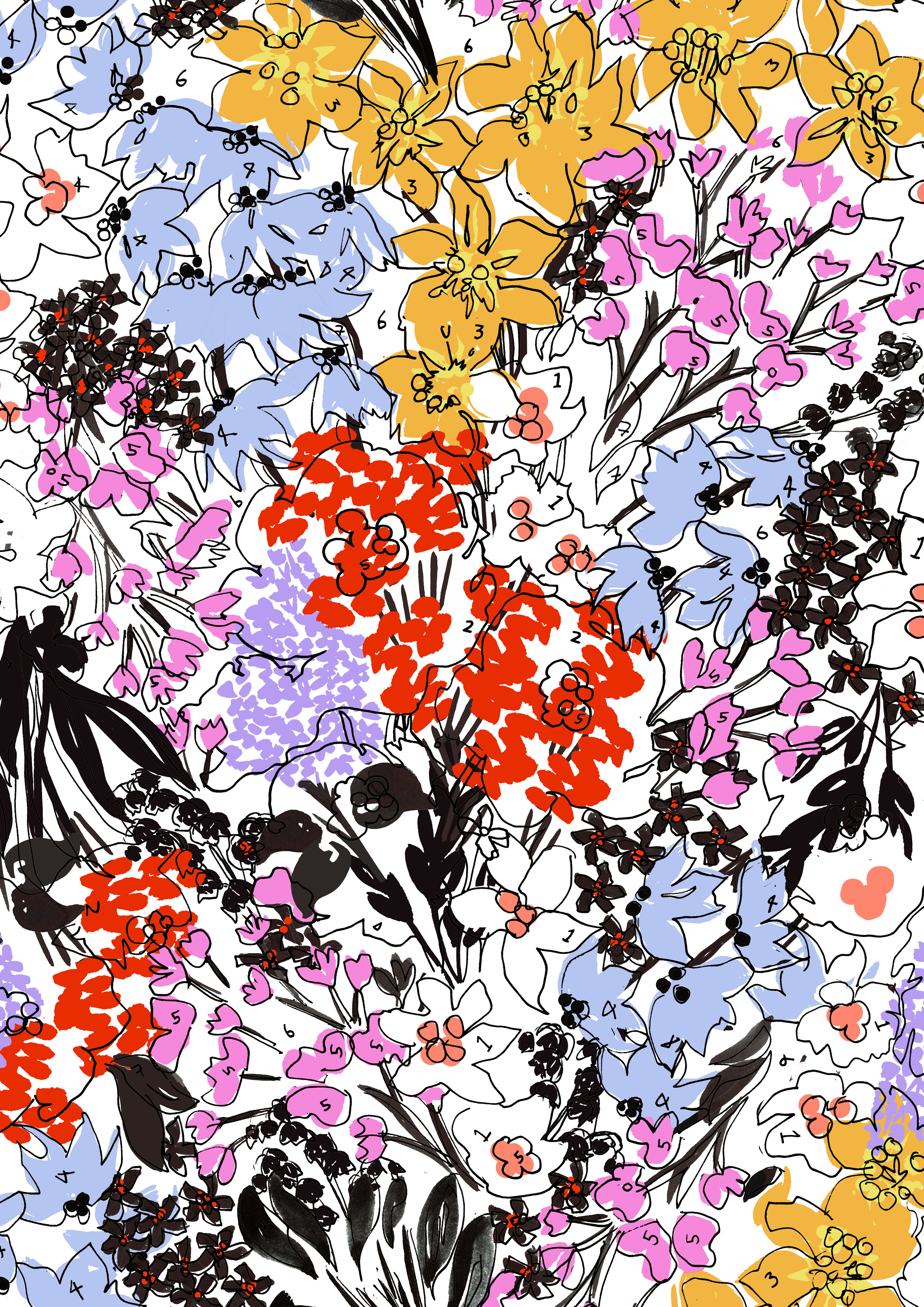
Rixo, Fabienne Chapot, Suncoo, Claudie Pierlot, Dries Van Noten and Kitri Studio have all been influencers of how the prints have been executed and mixed and matched in this project.
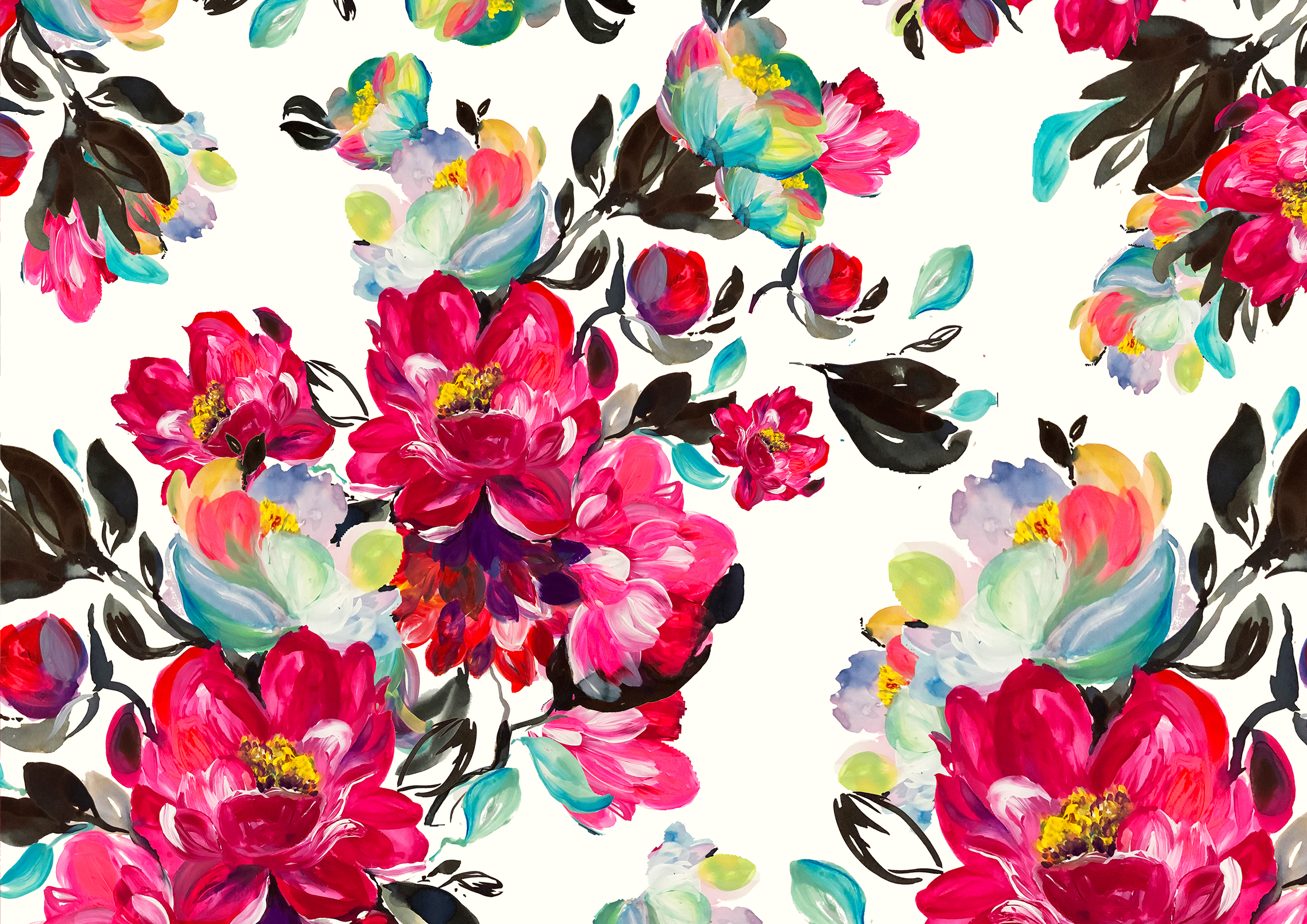
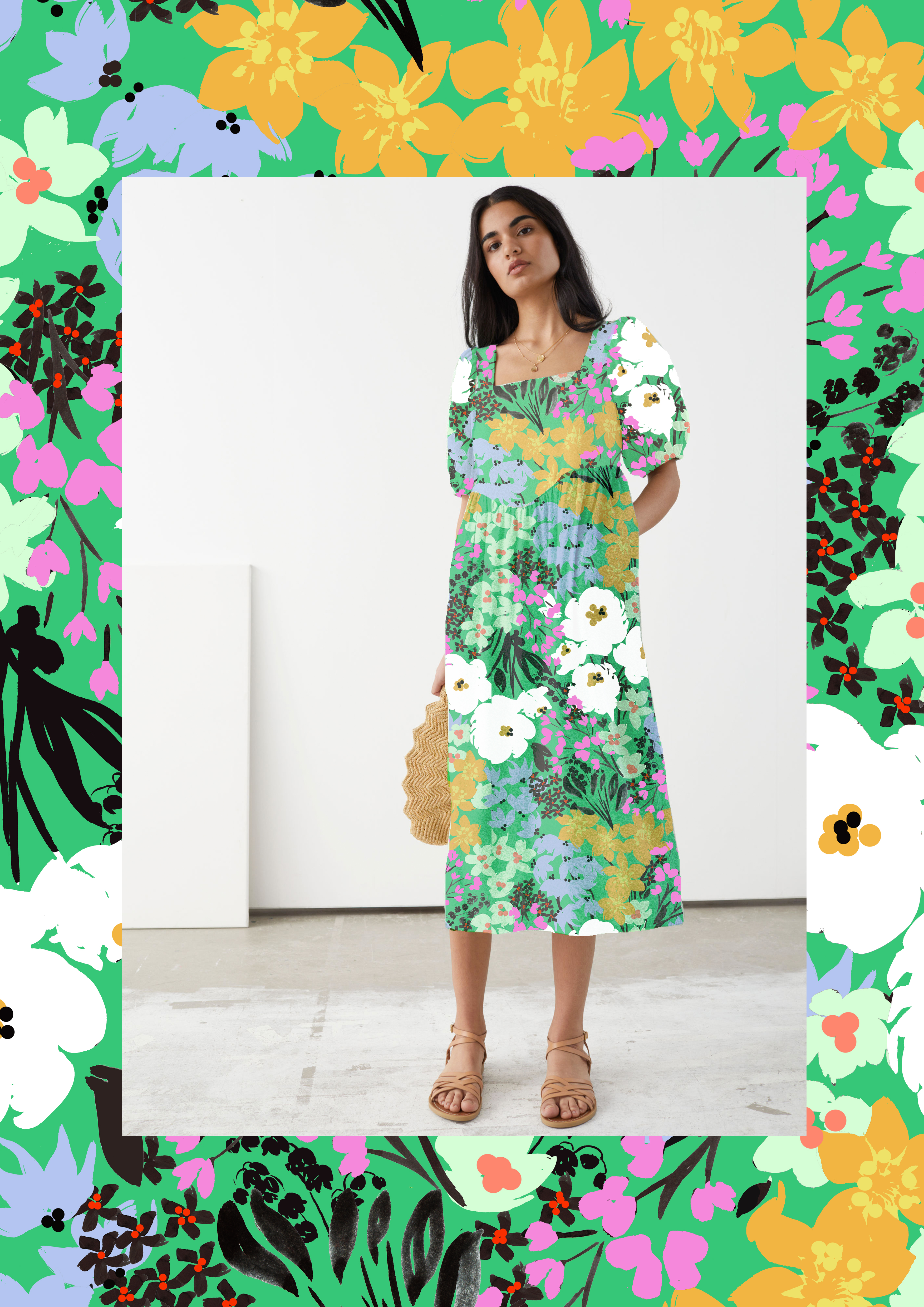
Florals are at the heart of the print collection, mixed back with cool conversationals and non prints, linking back to the main theme of the trend.
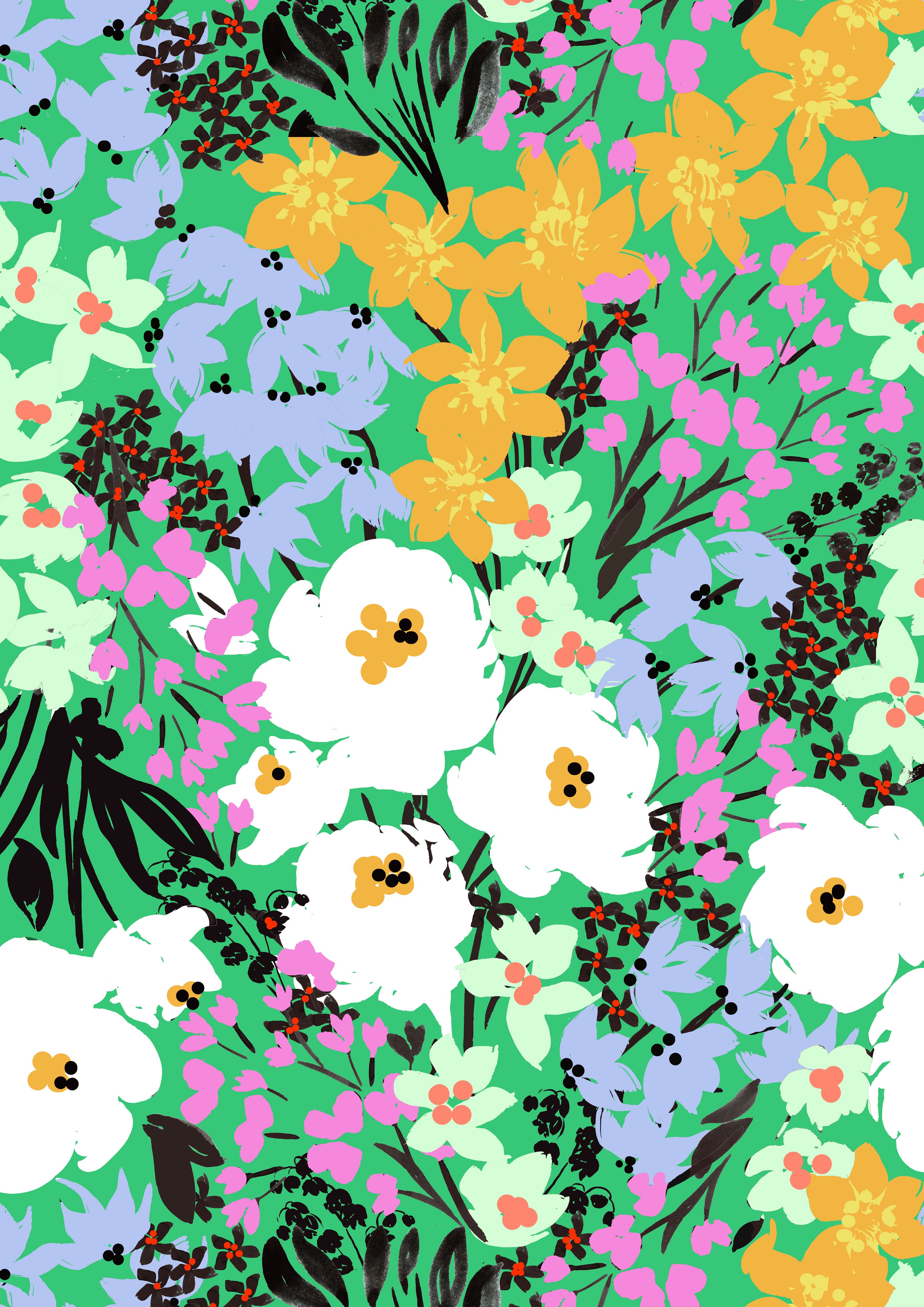
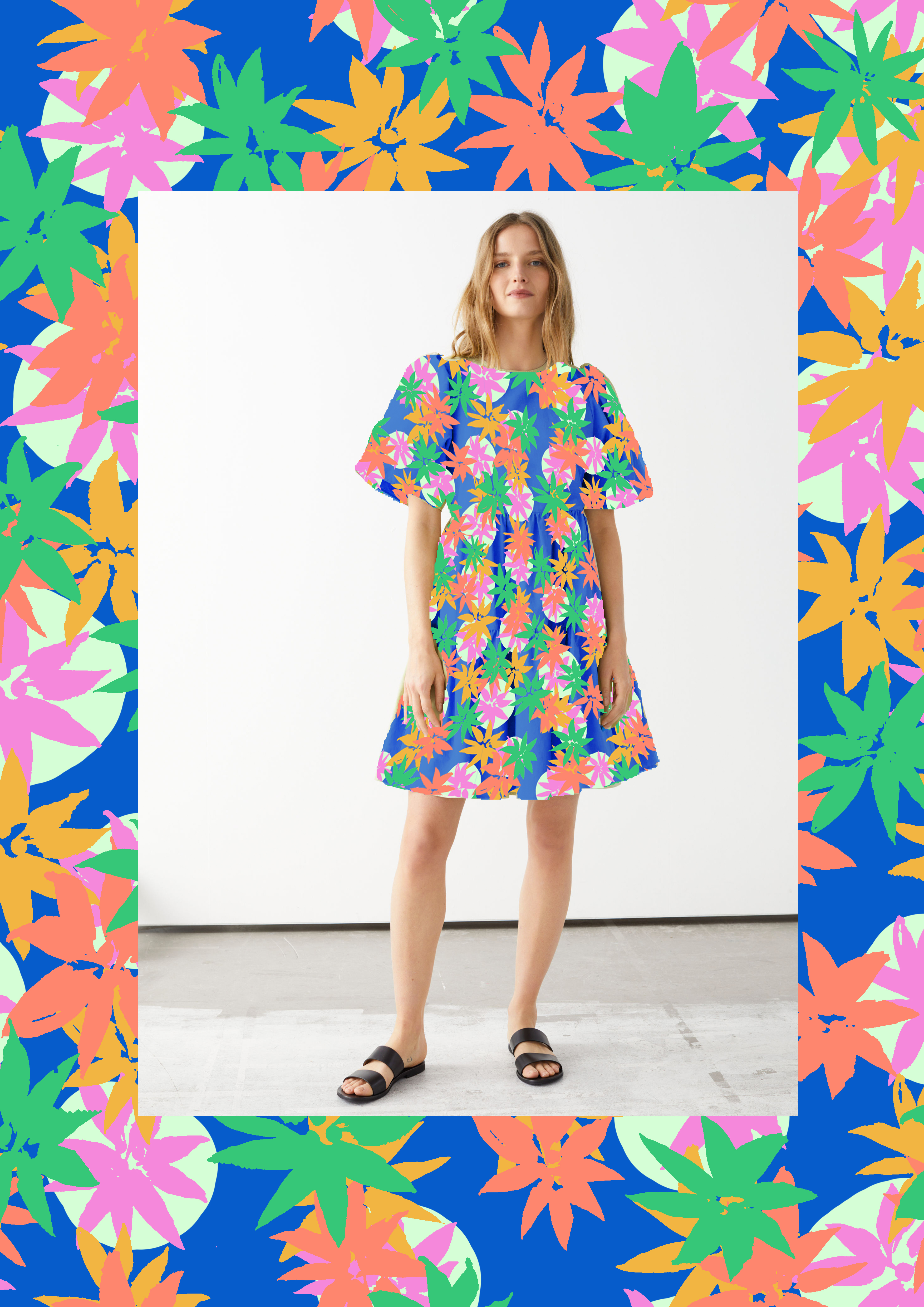
SEA BREEZE FLORAL – SCREEN PRINT
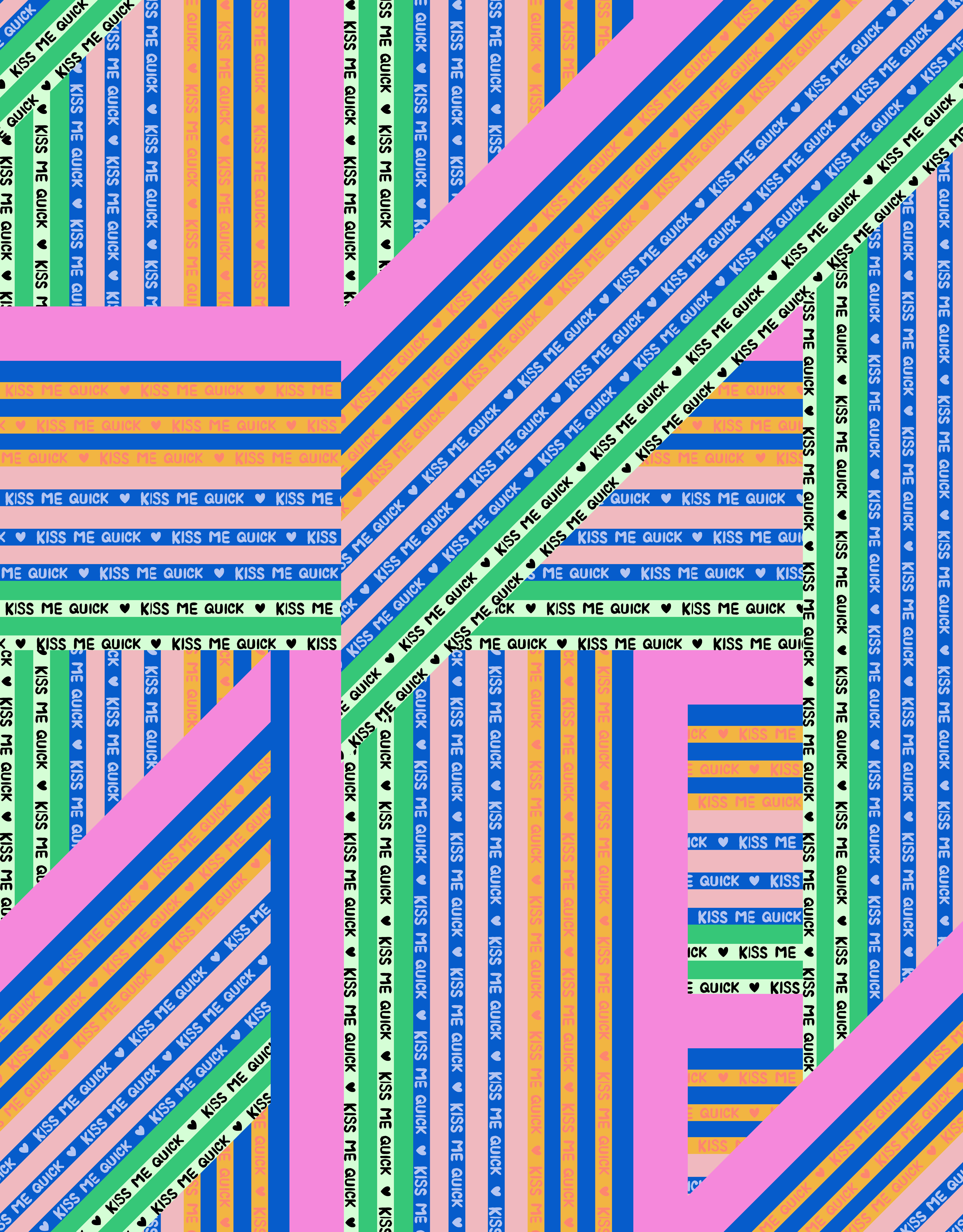
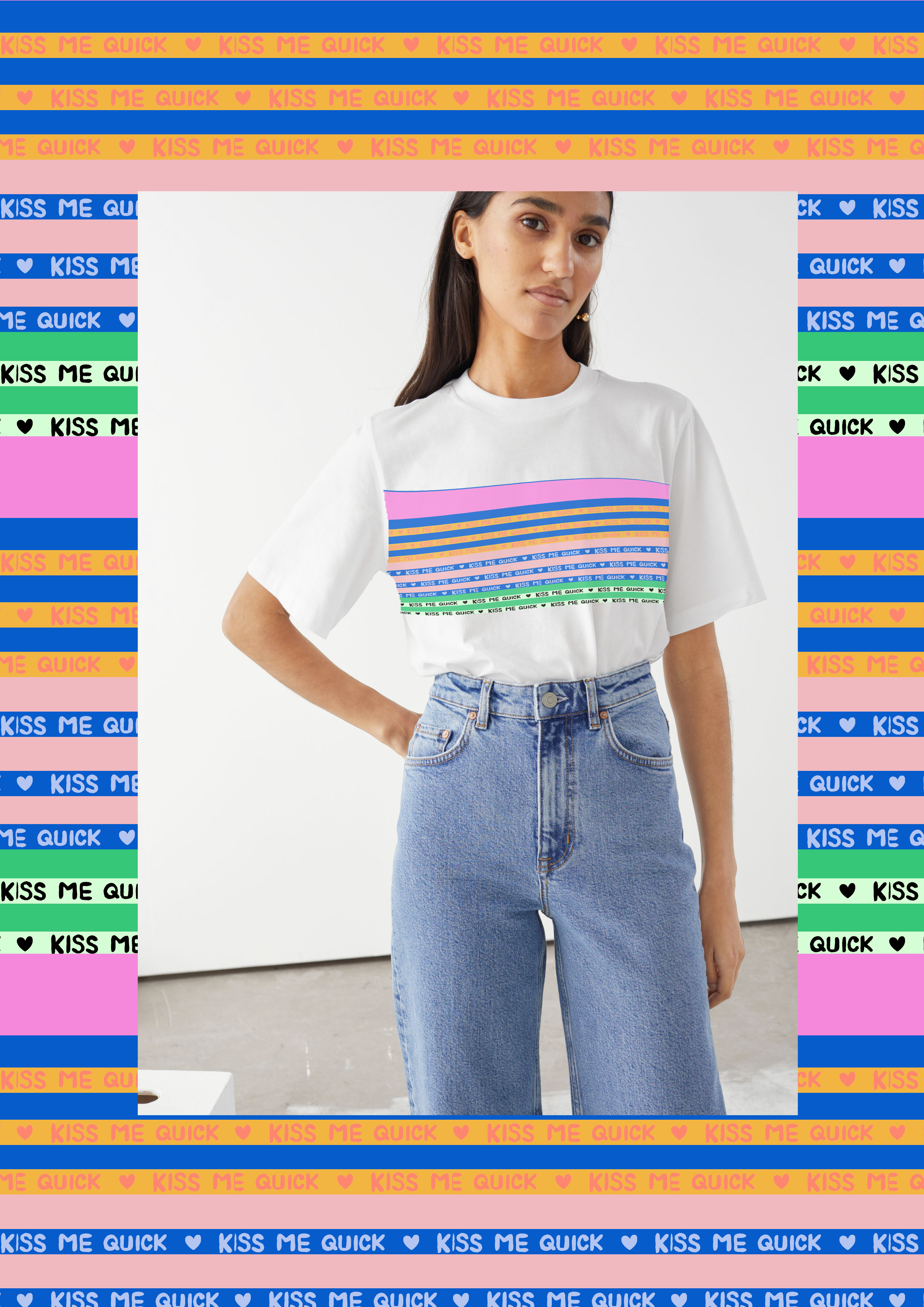
KISS ME QUICK VARIEGATED STRIPE – DIGITAL PRINT
QUICK DIP – SCREEN PRINT
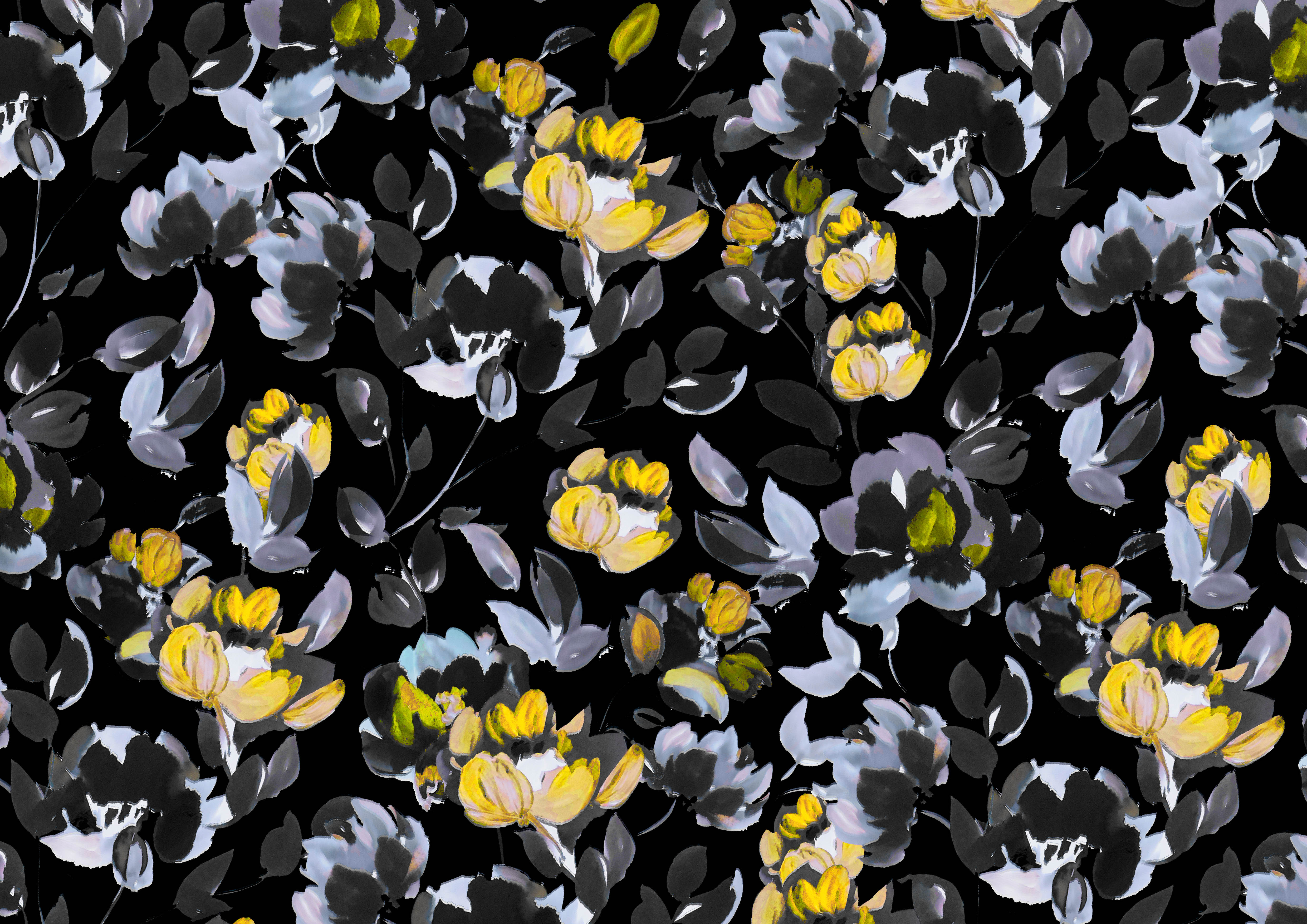
COLOURWAYS OF TOP STORE PRINTS


INDICATION OF PRINT USAGE ON GARMENTS
#STAYCATION
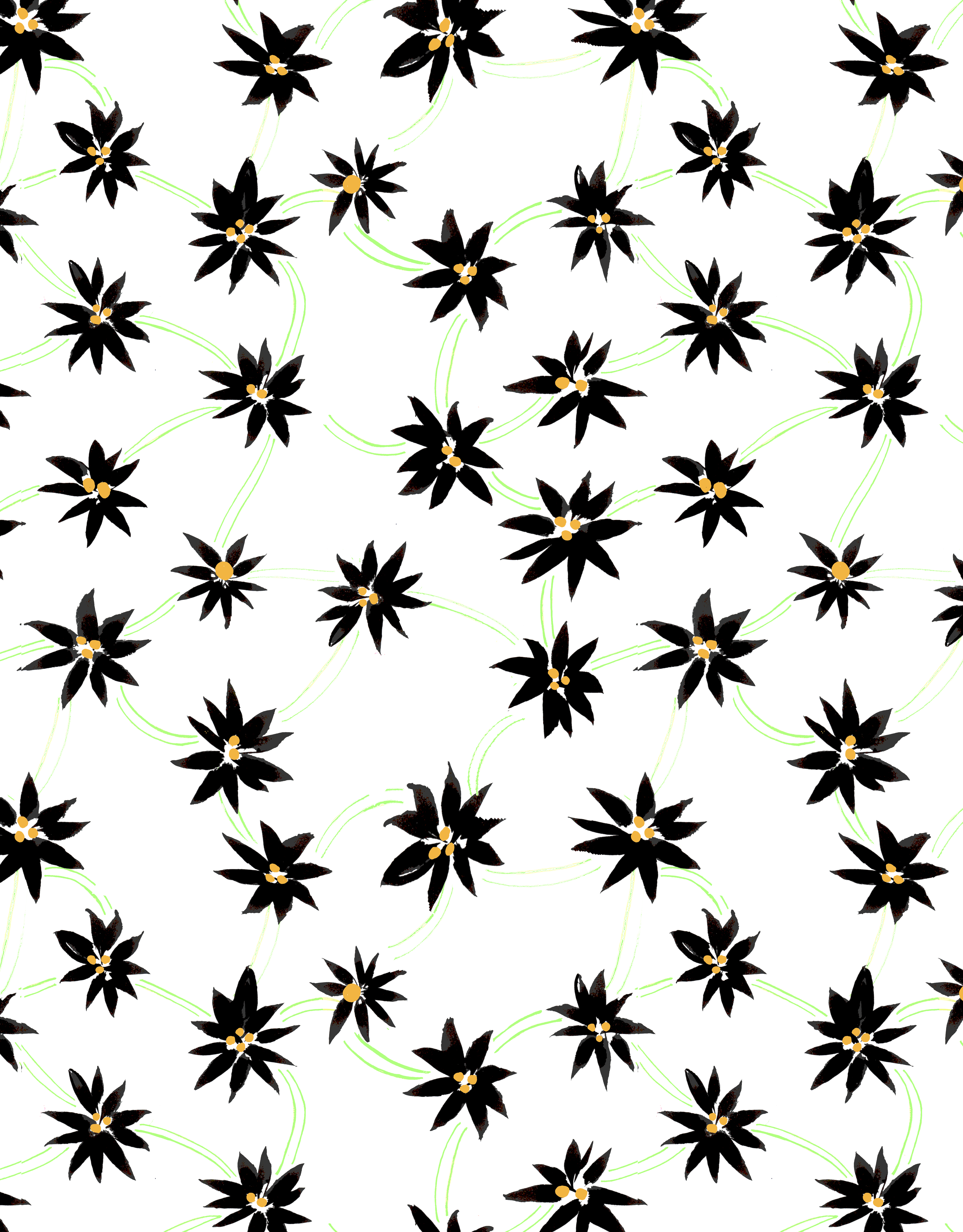
MID STORE PRINTS
DANCING DAISIES – SCREEN PRINT
DAISY CHAINS – SCREEN PRINT
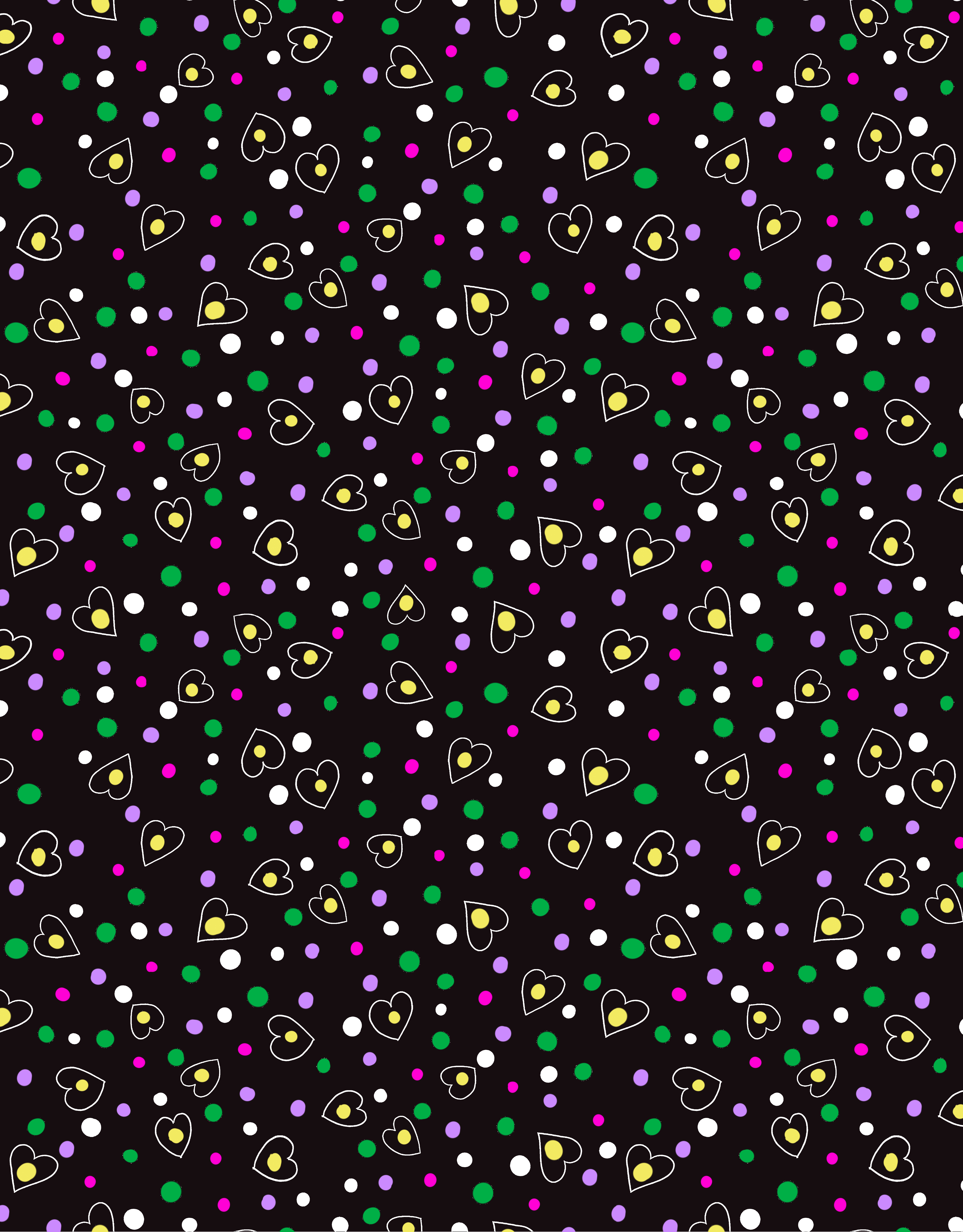
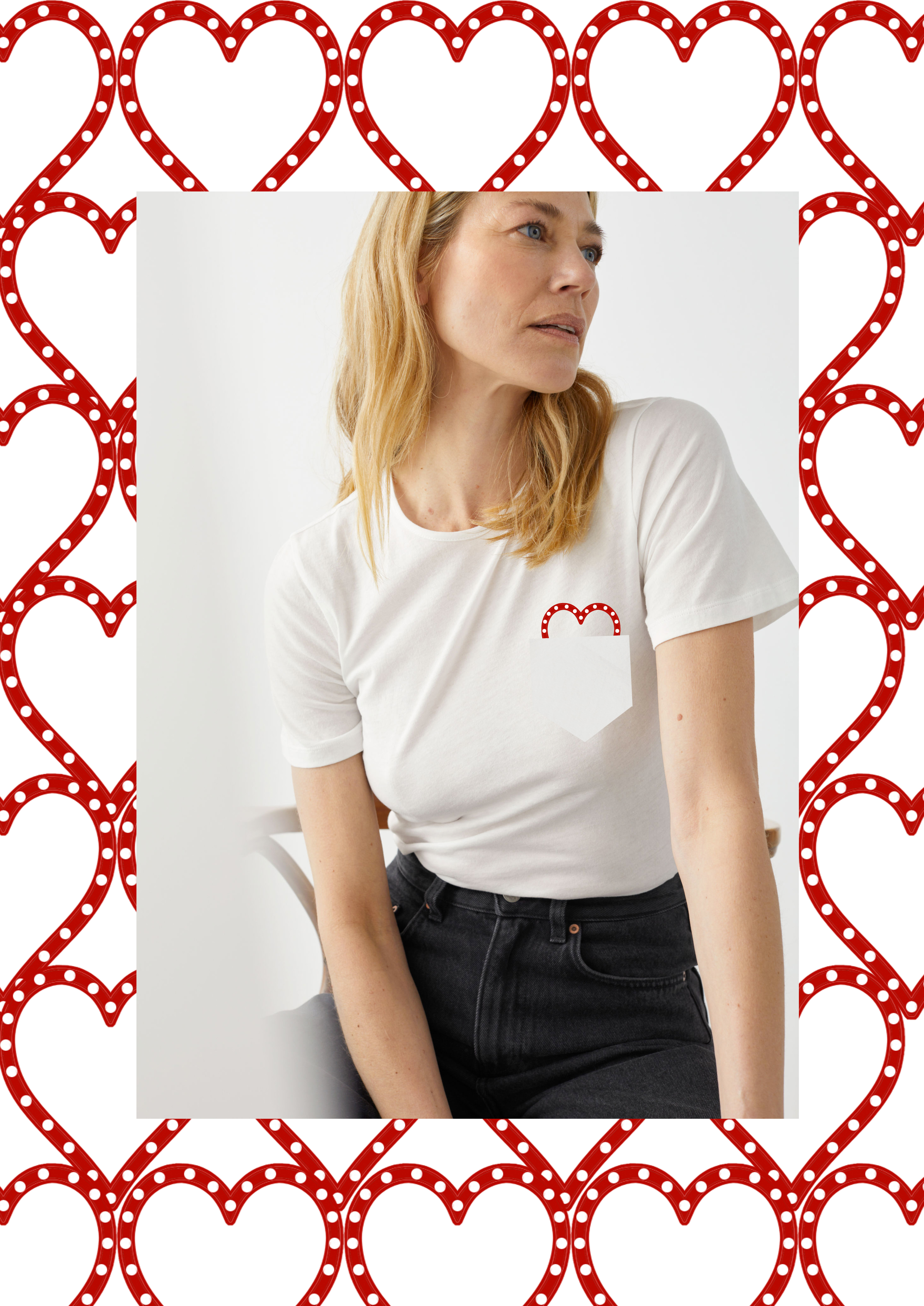
DON’T BREAK MY HEART – SCREEN PRINT
EXTRA COLOURWAYS OF MID STORE PRINTS


INDICATION OF PRINT USAGE ON GARMENTS
#STAYCATION
ALL STORE PRINTS (BROAD APPEAL)
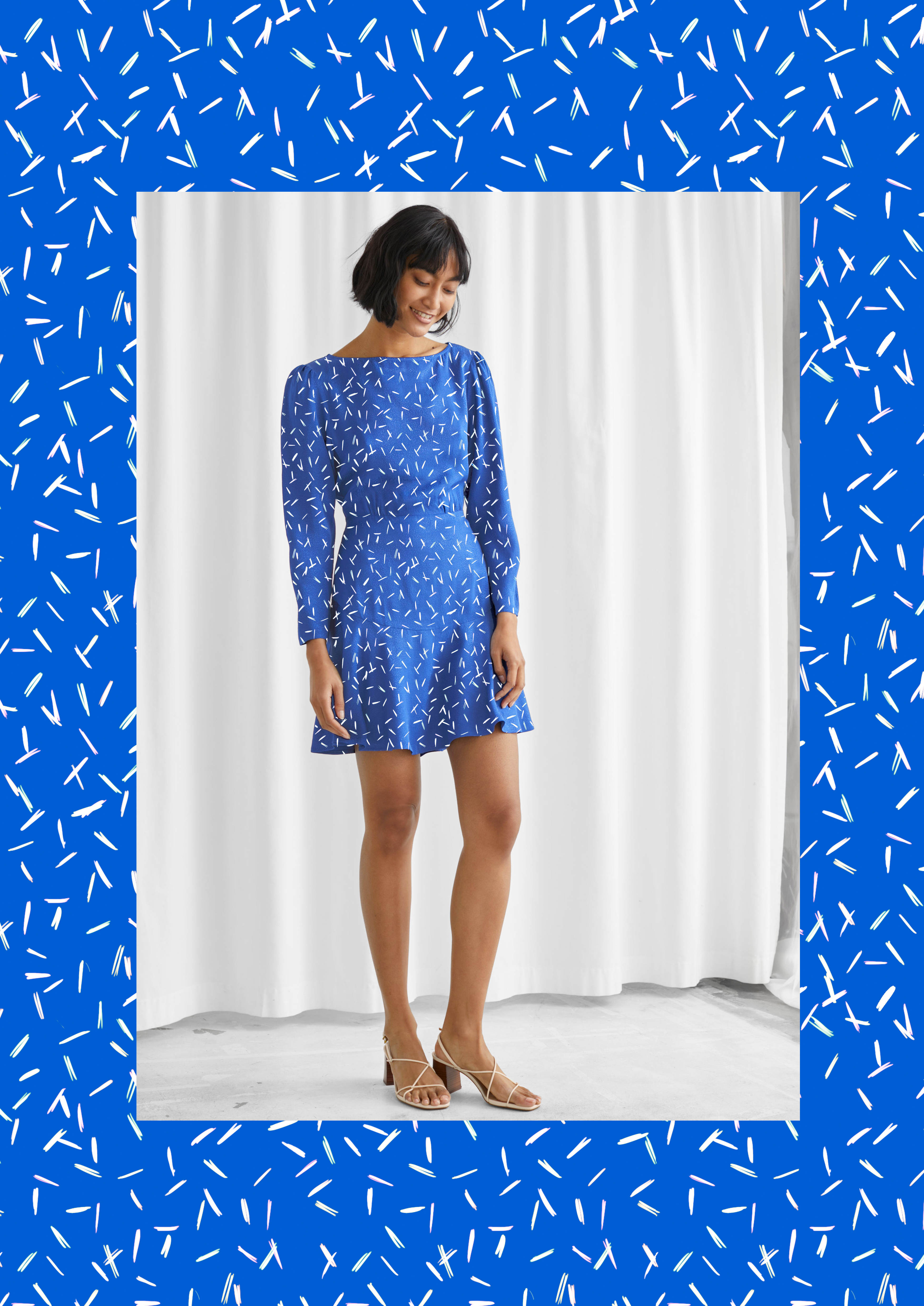
SWEET TREAT – SCREEN PRINT
COLOUR BY NUMBERS – SCREEN PRINT
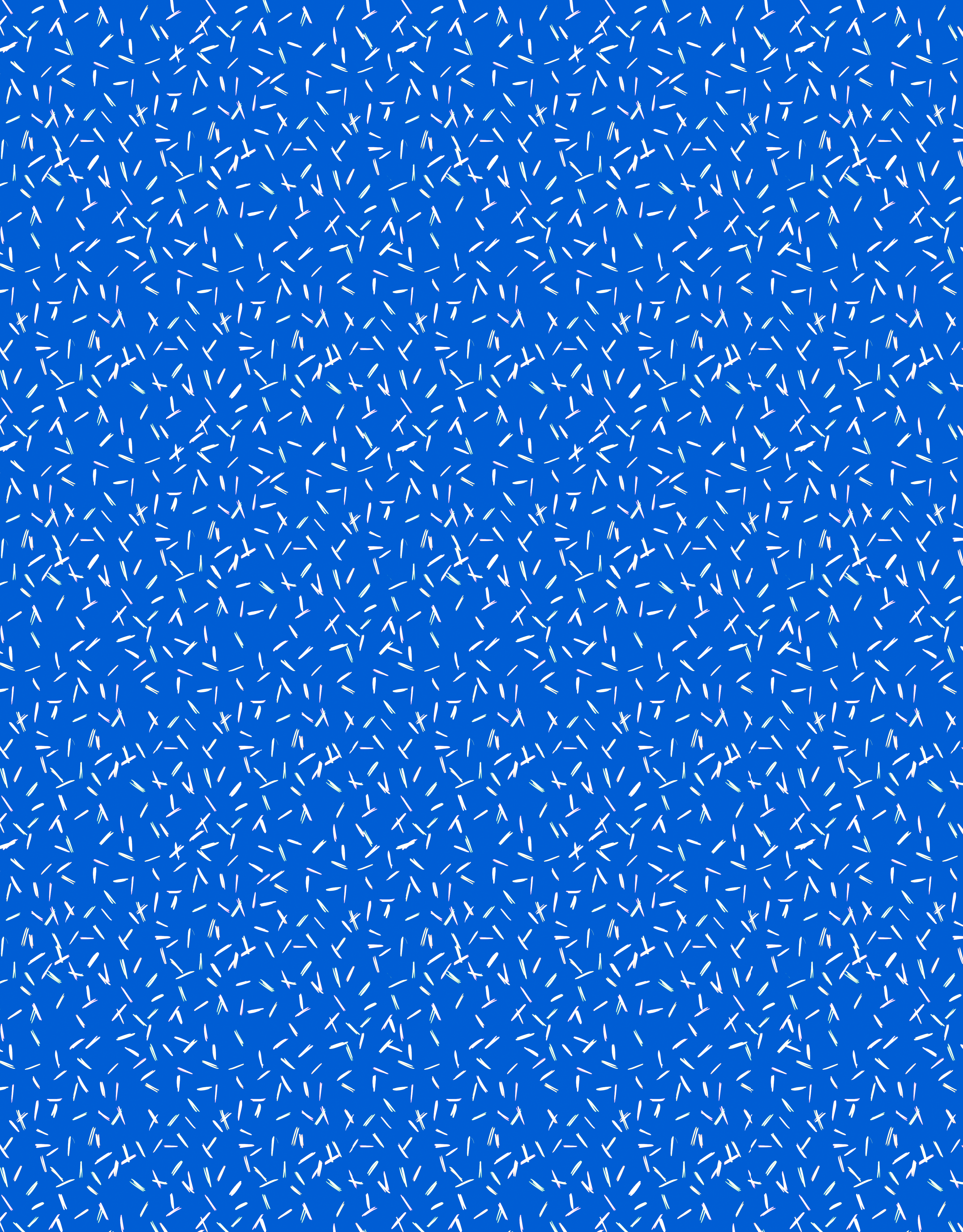
SPRINKLES – SCREEN PRINT
EXTRA COLOURWAYS OF ALL STORE PRINTS


INDICATION OF PRINT USAGE ON GARMENTS

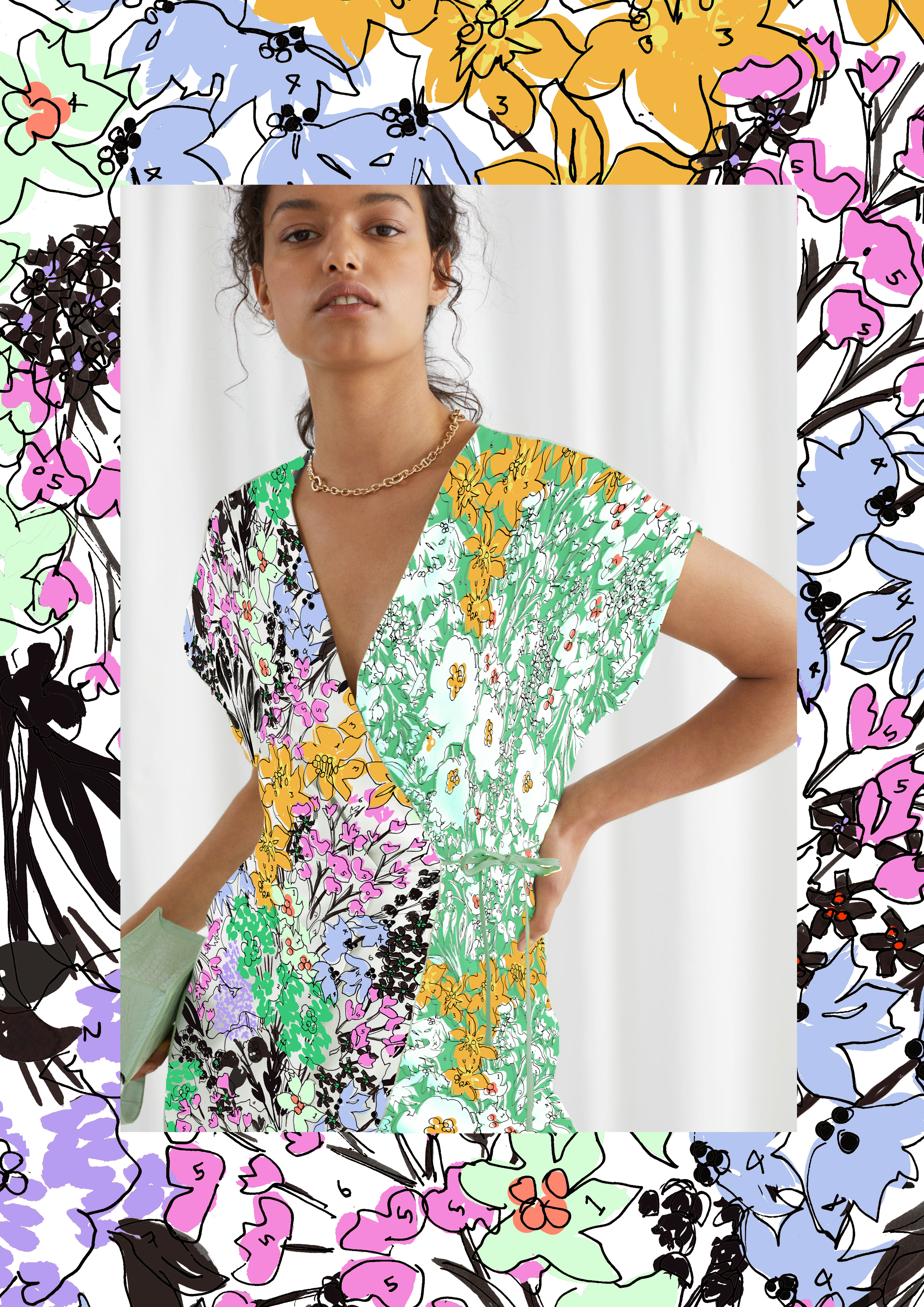
Top store needs the ‘Hero’ prints that will draw the customer and press in and play a huge part in the #STAYCATION campaign. 2 of these will be digital prints as the quantities may be lower at top store. ‘Summer Breeze’ is the hero floral printed large scale to keep it fresh and exciting, head to toe is key. The ‘Varigated Stripe’ is a sporty alternative to a normal stripe with ‘Kiss me quick’ incorporated and inspired by sticks of rock. (The variegated stripe is to ensure print registration is successful with no waves)
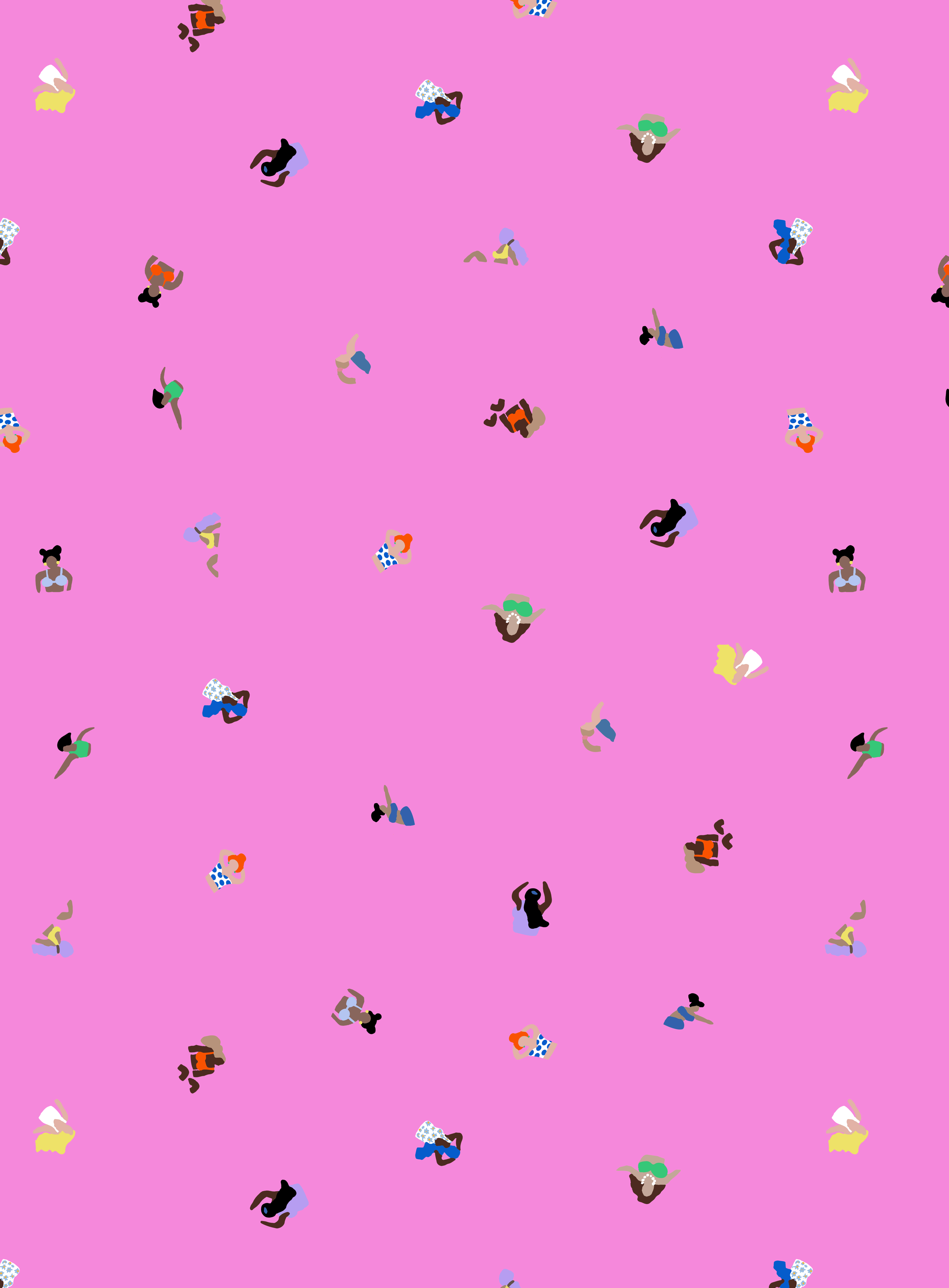
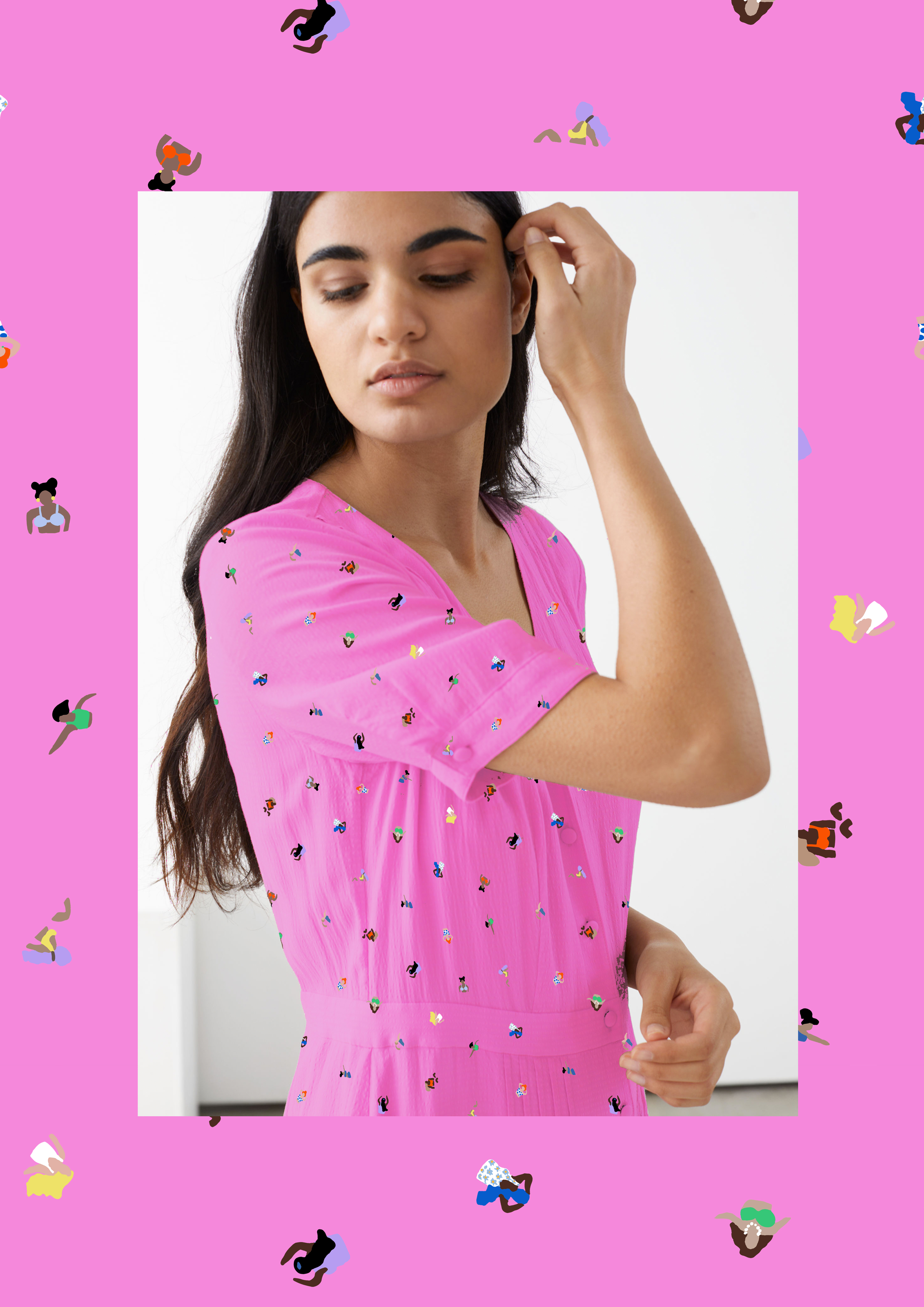
‘Quick Dip’ is a fun, inclusive and joyful conversational, that reads as a ditsy floral from afar but is female swimmers of all shapes sizes, races and hair colours. Simplified and enlarged slightly- this would make a great embroidery.
Mid store have some middle ground prints with interest, to refresh the mid range stores and keep them looking interesting.
‘Dancing Daisies’ is intended to be this group’s hero print, with ‘Daisy chain’ being more of a calm conversational in keeping with the theme, painted with Japanese brushes.
‘Don’t break my heart’ print is a ditsy conversational inspired by some of Rixo and Kitri Studio’s cool colour combinations and scales. I outlined a love heart around the yellow spot so it looks a little like a fried egg, one of those prints where people will but it because of that British charm and individuality.
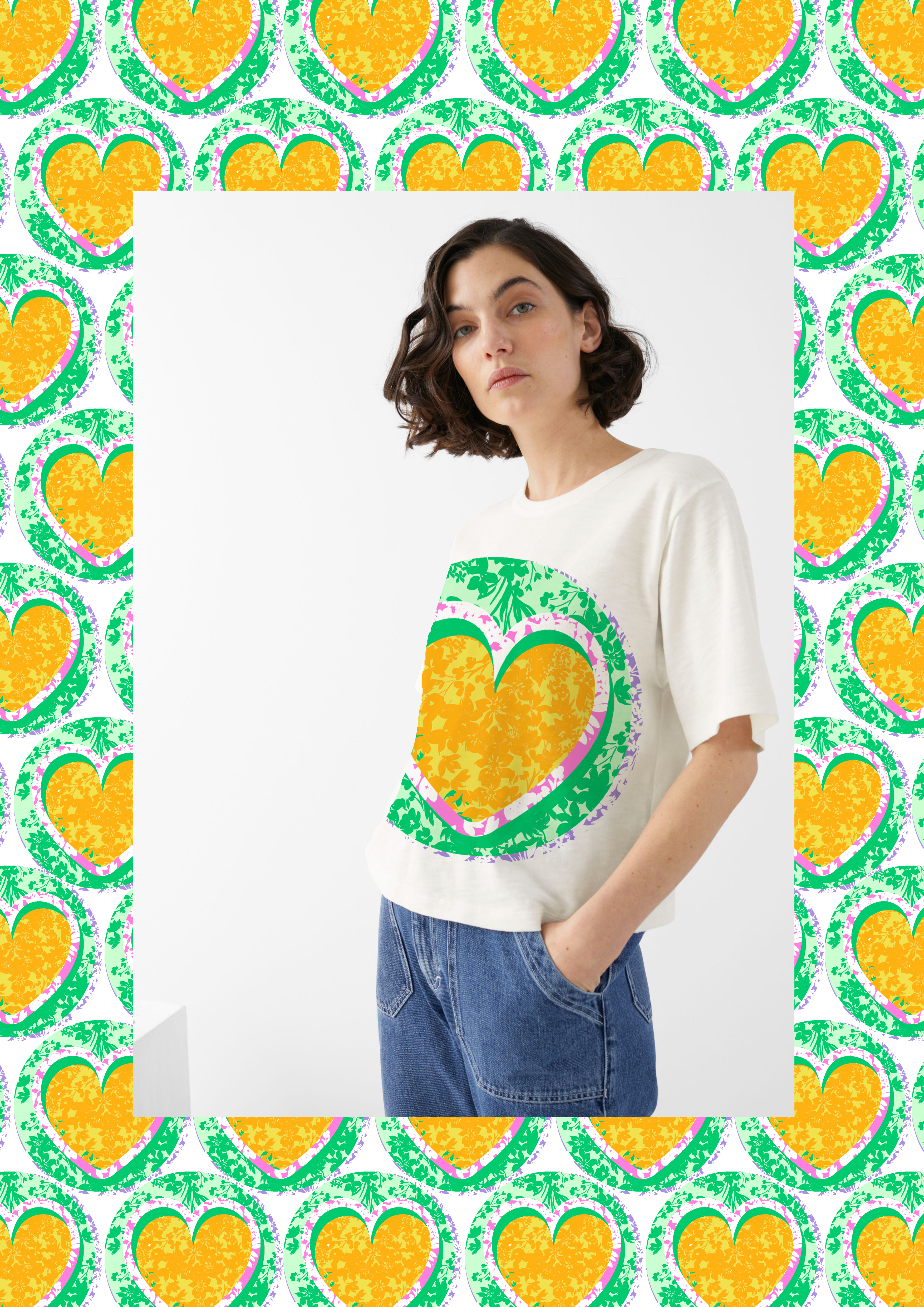
All Store prints are broad appeal but still interesting for the customers in the smaller stores, ’Sweet Treat’ is a love heart sweet inspired conversational print, this is a great colour vehicle as the print is simple with a lot of ground colour.
‘Colour by numbers’ is a colourful floral, needed for dresses and skirts to draw in the customer to the smaller stores, this creates interest and it is good to see the presence of a floral hook throughout the stores.
’Sprinkles’ is a simple 2 colour print inspired by ice cream sprinkles, this print is important to cover more of the ‘non print’ category, and can be for the more understated customer.
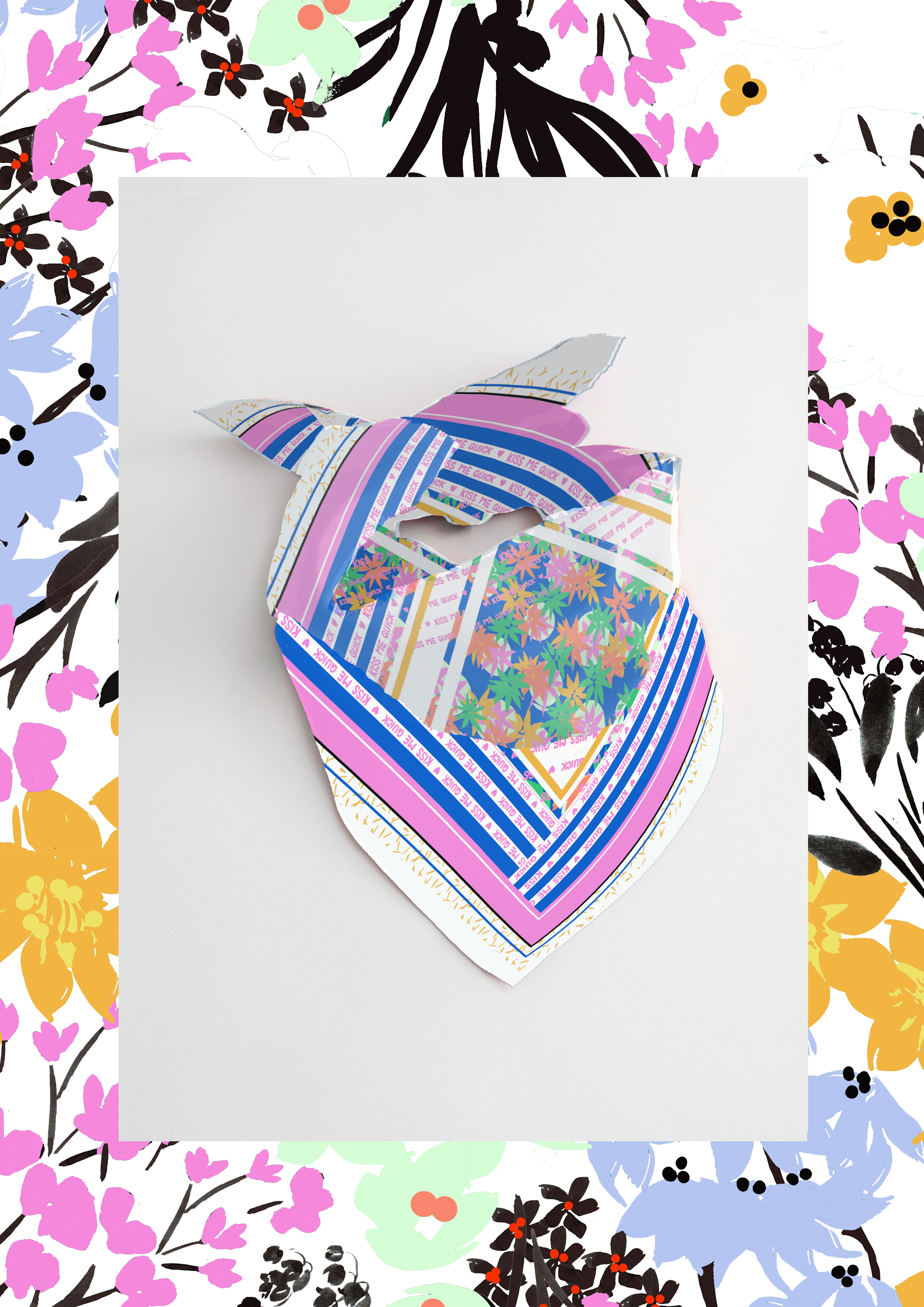
GRAPHICS AND ACCESSORIES IDEAS


TIME LAPSE PROCESS
All of the prints I have produced for this project are hand painted or hand drawn. I have used Indian inks, fine liners, pro markers, Arteza pens and an iPad and iPencil. I like to use mixed media within my patterns to keep the designs interesting.